LAV
Simple logos are the best.
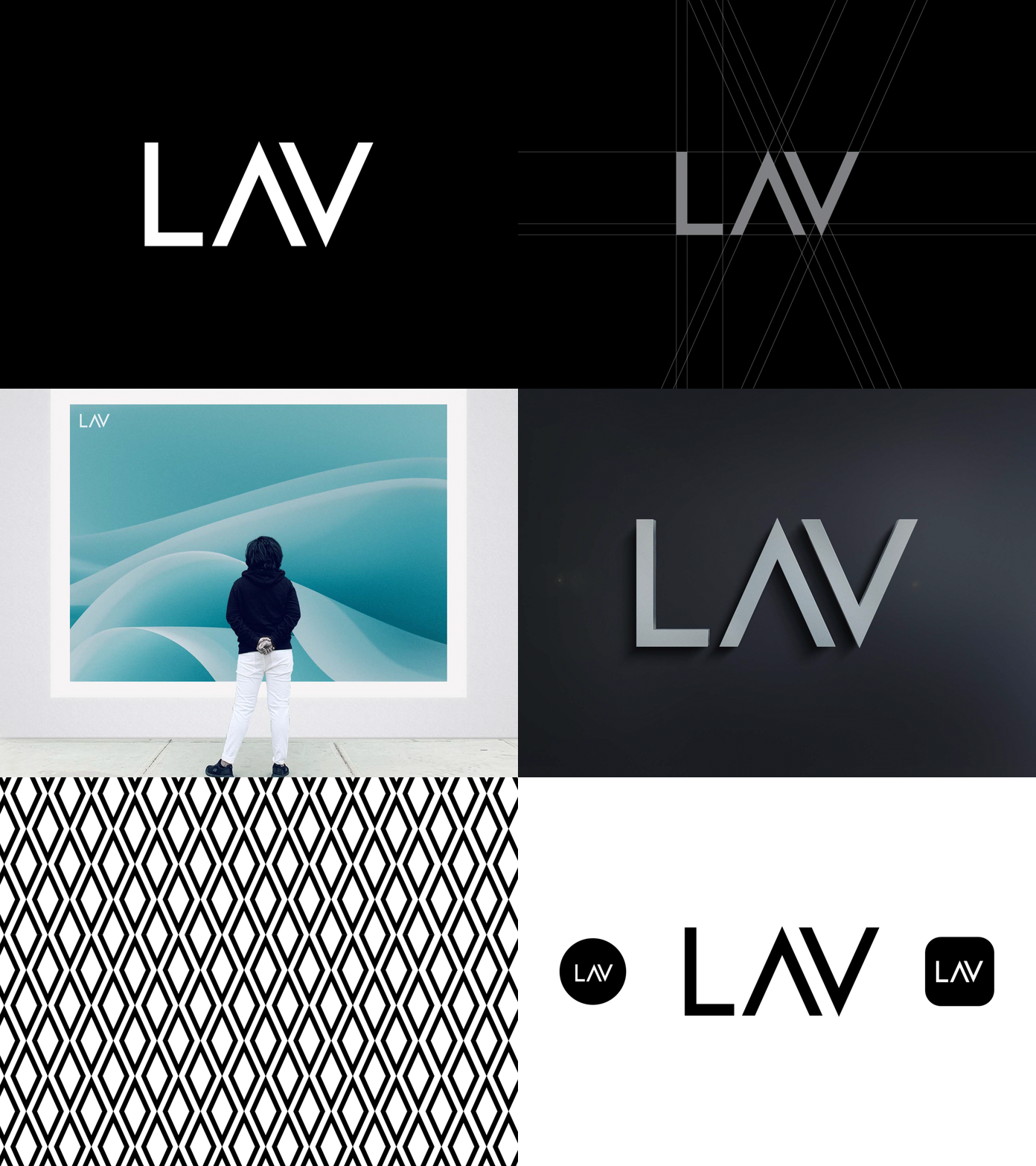
This is a logo from last year, I made the logo from a random sketch I made while I less busy. I did some retouching to it, I aligned the letters properly, resized the letter L, and removed the trademark symbol.
The pattern was formed by combining the letter A and the letter V.
Also like the way the business card turned out. 😀
Thanks for viewing!
More by Ifeolu Kayode View profile
Like
