🥳 CommandBar
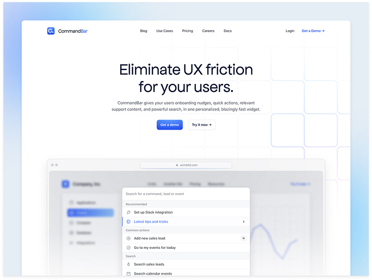
Over the last month or two, I have been helping out the team at CommandBar completely revamp their entire website. I can't wait until this one goes live!
Subtle gradients and geometric shapes
Throughout the design, I've purposely used a minimal colour palette. I wanted only to highlight specific areas of the design using the primary blue colour like buttons and call-out areas and then use pink and blue hues for the visual cues and background patterns.
We have also applied a glass-like effect on some of the containers, adding depth and a unique design pattern that can be carried through to the other pages.
More by James View profile
Services by James
Like


