Doodle Warriors - Rebranding
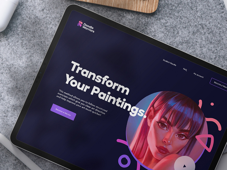
A few months ago, we were approached by Doodle Warriors — a community of digital artists with Angel Ganev, a young Bulgarian influencer at the helm. Through their Portrait Accelerator program, Doodle Warriors impose a warrior mentality on artists to push through necessary hurdles and improve their skills by following a proven structured method.
Doodle Warriors were looking to update their complex brand and visual language while keeping some of the existing brand elements, and a slightly tweaked color palette. At the time, their logomark consisted of a warrior helmet with a doodle of a DW anagram, two pencils, and a sword, as well as a 3D wordmark that holds a shield and another pencil. As you can see, the complexity was off the charts, so we dived in to try and extract the essence of the brand.
While we've produced several different takes and explored the brand update from all angles, our main goal eventually ended up being creating a recognizable logomark that will consist of a DW anagram that could be used as a standalone, and a legible wordmark to support it. The essence of this change was to be able to use the logo on different mediums, which is something their old logo was lacking. As for our solution, the negative letter W in the logomark was used to present the actual cuts, similar to ones you can do with a sword, while the remaining slices of the letter D would be covered in their existing yet slightly tweaked color palette. We've also supported their visual language with a pattern of doodles in various sizes, shapes, and forms.
While Doodle Warriors team liked what we have produced and the extraordinary effort we put in, they’ve decided to take the brand in another direction that will more excessively steer away from what the current brand is. Yet, by puting our heart and soul into it, we wanted to shed some light on a project that will never see the light of day.
--
Let’s discuss your next project.
— WE MAKE THE NEW.


