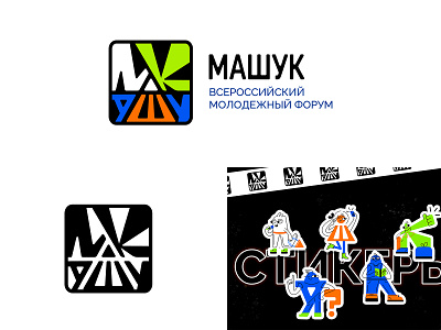
Logo "Машук"
«Машук» - is a whole university that will allow participants to develop their own projects, and then develop them in their cities and villages. The university organizes real workshops, within which teams of participants will create different products - educational courses, art objects, cultural festivals, websites and much more - everything that can find further practical application in life.
Concept: it was decided to leave Mount Mashuk in the logo, but to beat it so that the logo was non-standard, modern and interesting. The mountain is located in the center of the logo (triangle), letters stretch from it (the name of the forum). The letter W under the triangle complements and is the lower part of it. Also , the triangle is part of the letter M. All elements have "soft" corners (reflects openness, benevolence) and are placed in a square. The square unites all the elements, prevents them from merging with the background, and is convenient to use on various media.
The main idea of the logo is that all the letters stretch to the center, this symbolizes the desire of participants for new knowledge, development and communication that they receive by participating in the forum.
Thanks to the perspective, the logo looks dynamic, which also reflects the essence of the forum, its active events and activities.
Full presentation of the logo on Behance - https://www.behance.net/gallery/143539539/mashuk-logo-identity
My contacts: +7 926 990 62 88 | instagram | anru.design.art@yandex.ru
