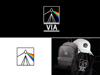
Logo "VIA"
VIA - rock paraphernalia store. In the store you can buy themed clothes, shoes, accessories, cosmetics, souvenirs, jewelry,musical accessories (guitar strings, picks,drumsticks, etc.).VIA (from Latin - path) is a philosophical path of like-minded people following freedom, dreams, common goals and friendship.
The analysis of competing stores, logos, similar in subject matter (logos and design of rock bands, themed clubs, bars).
An exquisite, minimalistic and modern logo has been created, which will be globally different from competitors.
Description: the logo is based on geometric shapes with pointed corners (squares, rhombuses). The main composition is in a square frame, the center of the composition is a rhombus that hangs over two triangles. Triangles symbolize the road or path (as the philosophy of the store). They are directed to the center, to the rhombus. This can be interpreted as a path to a single goal, a dream. Also in the logo, the rhombus is a prism through which light passes and is divided into a spectrum of colors, this is a reference to the Pink Floyd album "The Dark Side of the Moon".
The logo of the full version has a font part - the name of the store. Due to the fact that the name consists of only 3 letters, it harmoniously and neatly fits into the brand name. It was decided to add two wide lines to the name at the top and bottom to make the logo look complete and authentic.
Full presentation of the logo on Behance - https://www.behance.net/gallery/140293029/VIA-%28corporate-identity-logo%29
My contacts: +7 926 990 62 88 | instagram | anru.design.art@yandex.ru
