aMail - update your inbox to be agile

Situation
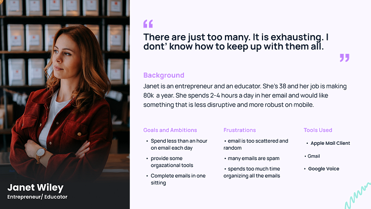
A busy entrepreneur needs a quicker inbox. We're here to help with A-Mail.
Duration: May 22
from endless to organized
Stage 1: Market Research
During a competitive audit of apps such as Microsoft Office and Outlook for Gmail, a gap was identified in organizing an inbox. Furthermore, an opportunity was identified to shift the user's mindset from staying busy to being productive.
Problem statement: the modern technology entrepreneur needs an email client that is quick and effortless for communicating outside the company channels. People with high paced lives need a tool that will help keep up with them and that mirrors many of the other online platforms used for internal purposes such as Jira, Trello, and Slack.
help me! there are so many
Stage 2: Interviews & Empathizing
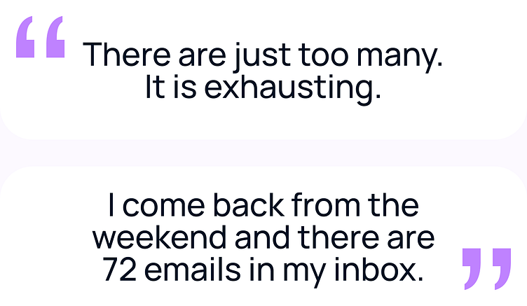
Through phone interviews, users expressed a need to manage numerous emails fast, and easier access to surface level responses. Additionally, frustration, exasperation, irritation, and demotivation were identified to describe a disconnect when utilizing existing applications and current user expectations. Through personification, establishing an efficient workflow was prioritized to transform the current limitation into a form of empowerment.
get me to the bottom of it
Stage 3: User Flow and Wireframes
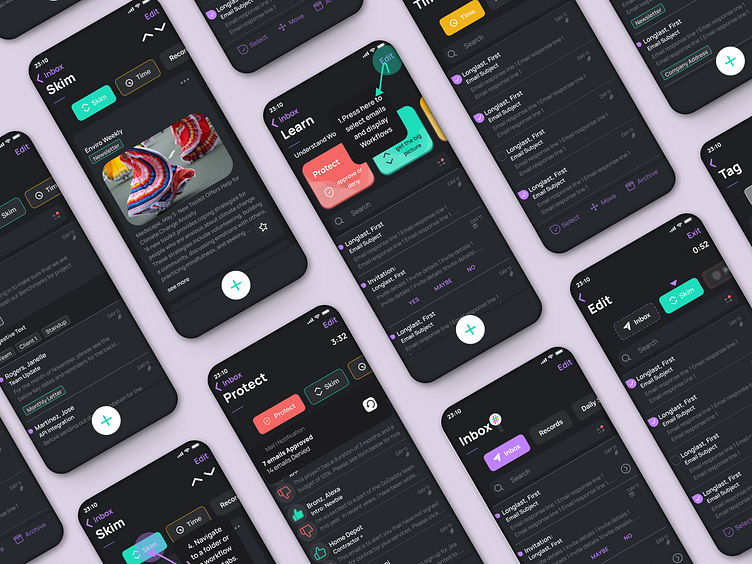
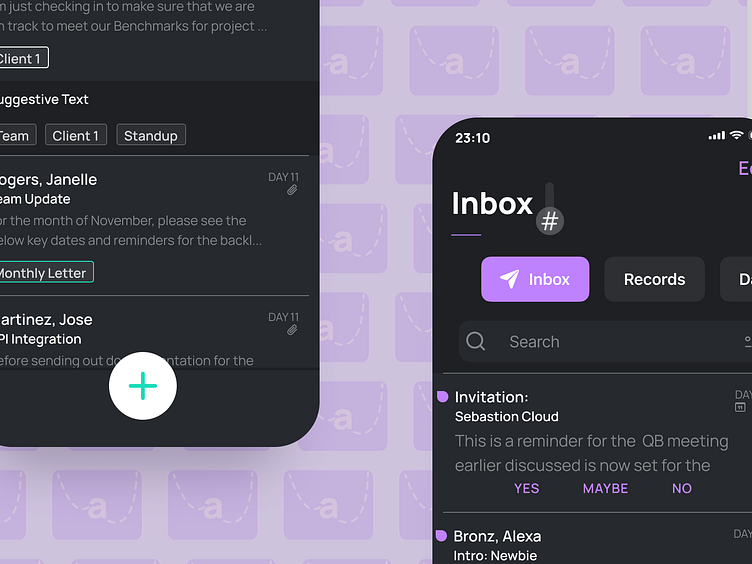
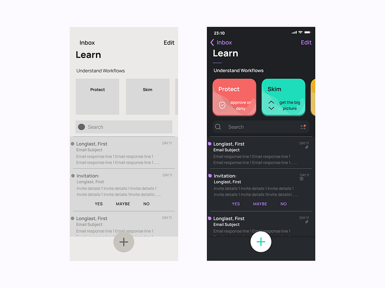
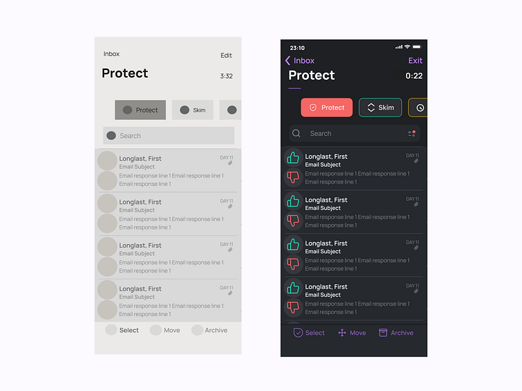
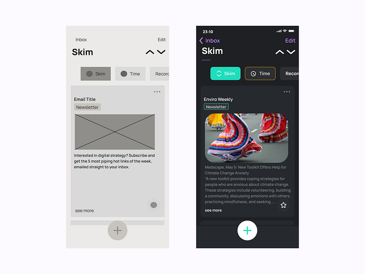
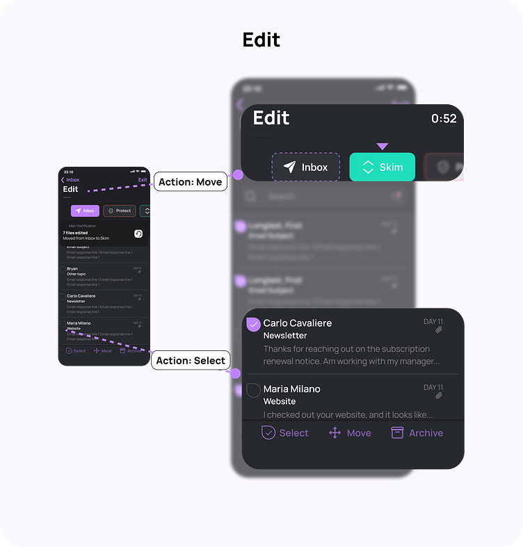
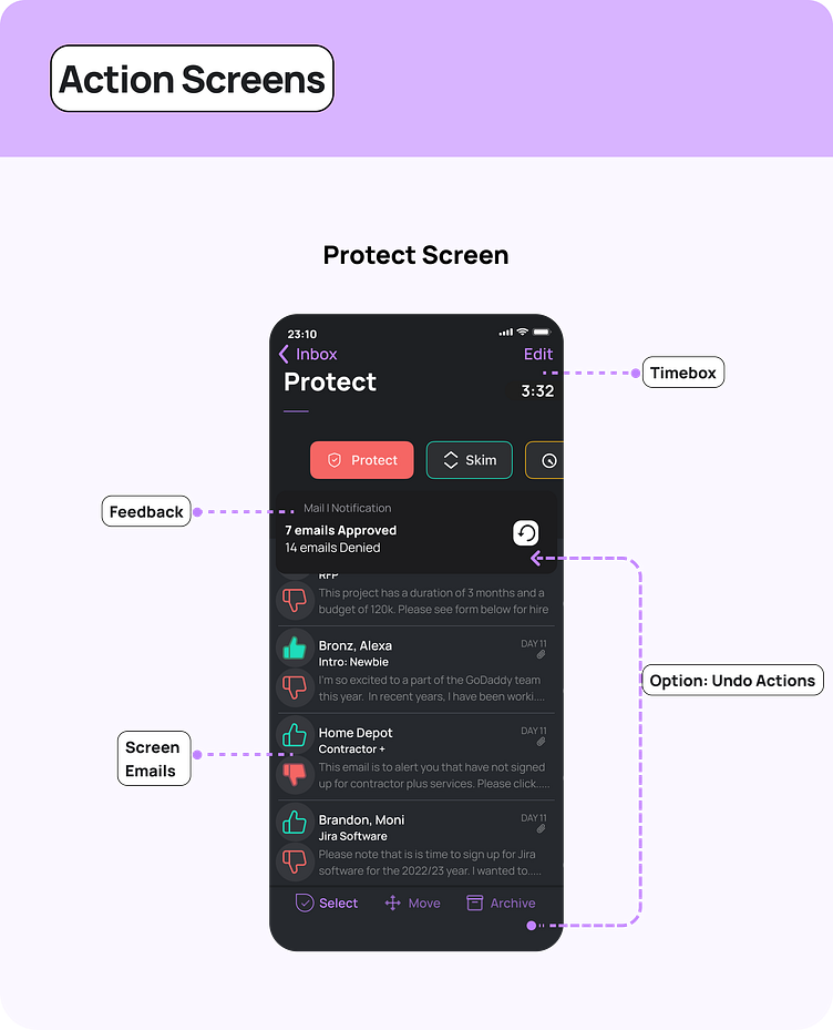
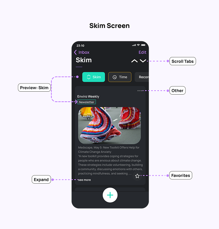
A user flow starting at the inbox and ending in adding tags to individual emails was identified as an ambitious happy path. By leaning upon Agile practices such as mitigating switching costs and introducing task chunking, three core workflows were included: Protect, to keep out unwanted emails; Edit, to organize emails into folder represented with tabs; and Skim, to preview long emails at once in one place.
As a consequence, this created complexity with cognitive load for the user to learn these new workflows. To minimize the switching cost from existing email clients, these workflows were designed around existing interfaces: Protect is similar to Amazon’s music like/ dislike interaction, Edit - is heavily influenced by Gmail’s and Mint’s edit features; and Skim is similar to Apple Email client’s previous and next interfaces.
quick views and quick actions
Stage 4: Visual Design and Critiques
A practical choice of font style and design direction were chosen to place an emphasis on the content and workflows. Forcing functions such as different bottom navigation bars, blurred tabs, and existing email signifiers such as swipe interactions or an ellipse to signify an unread email were recycled design trends to keep the scope of learning the app to a minimum. Although the color direction was close to a proportional representation of 60 % for the layout, 30% for the primary, and 10% for the interactive; denotative, whites, and neutrals colors were also integrated to provide a wider spectrum of options in the visual hierarchy.
show me more in more ways
Stage 5: Prototyping and Testing
Through various design critiques, user testing, and numerous prototypes, many of the workflow components became more clear and increased the value proposition by providing more access points to features and eliminating noise by cutting back on repetitive elements.
Iterations: Through prototyping and testing, the following updates were implemented:
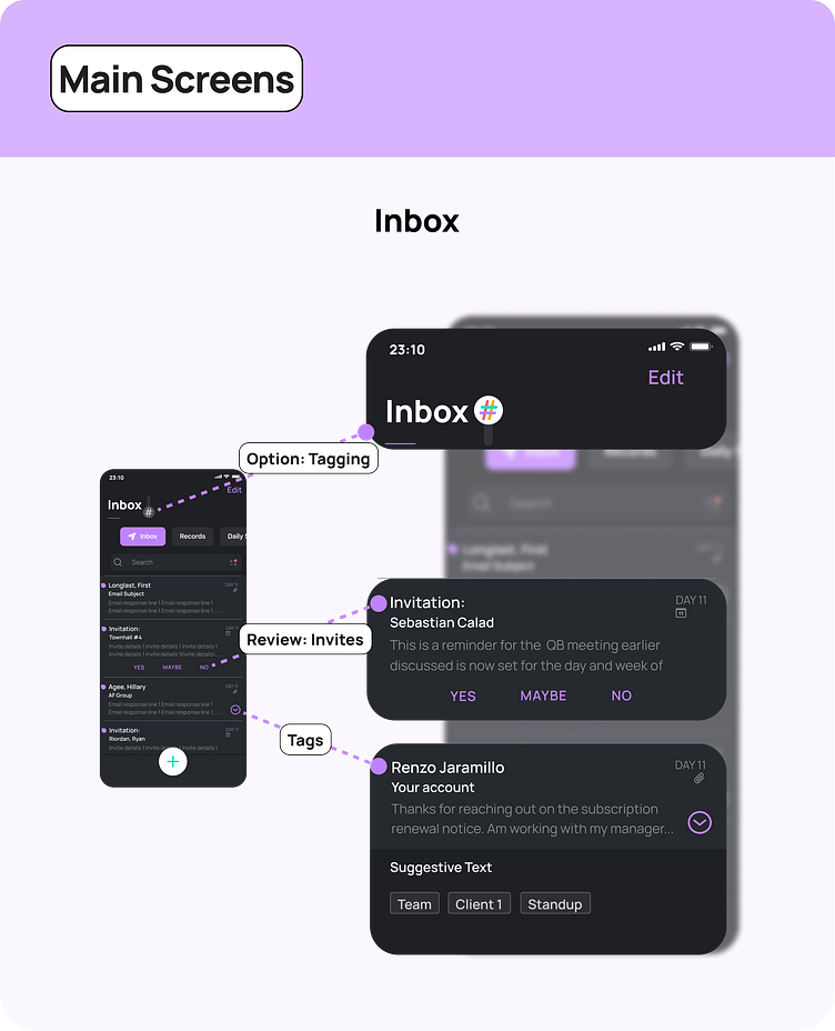
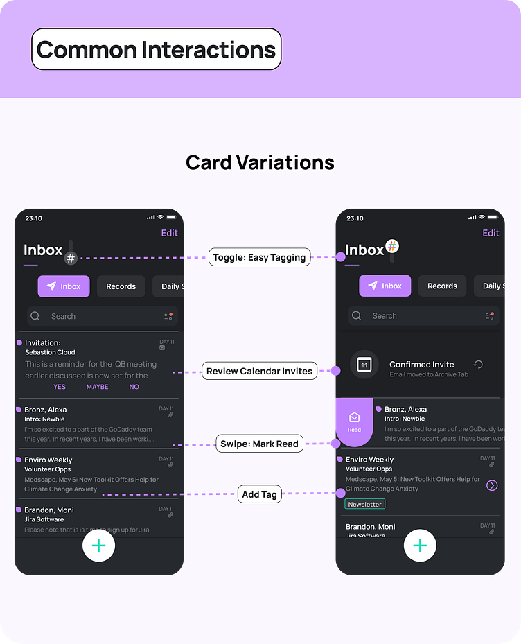
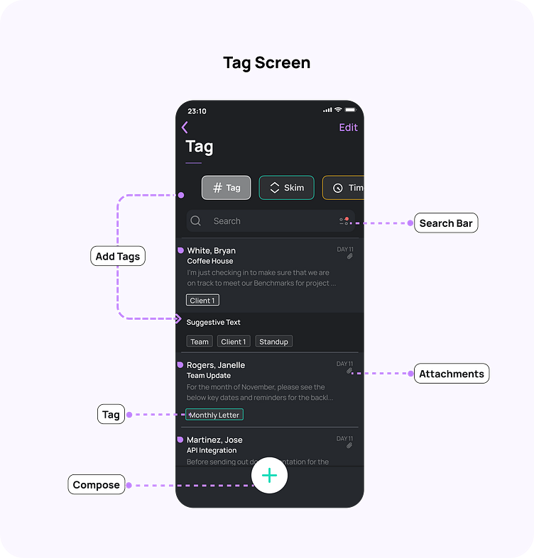
*users expressed a desire for tagging all in one place; so, this was added as an additional workflow tab. Moreover, it was subtly moved to a toggle button to hide repetitive elements and reduce visual noise in the inbox screen.
*A clearer visual hierarchy was iterated upon to match tags with workflow tab outlines.
*The calendar invite card was improved by removed redundant icons.
* Additional, learn/discover tutorials were provided.
* A toggle to provide access to tagging from the inbox was added and carrots at the card level were removed.