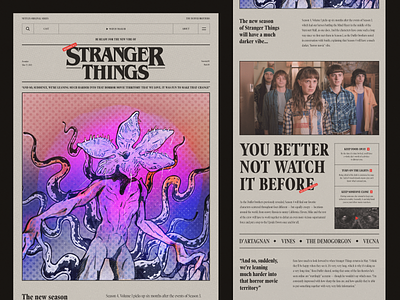
Stanger Things Announcement Design
Stranger Things to everyone!
This shot is a site/article/announcement of the new season of Stranger Things, which talks about the unique "horror vibe" of the series. I took an article on the site from Tudum Netflix as a basis, where they interviewed the creators of the series, and we'll start from here.
A retro vibe is the heart and soul of this shot, given the series takes place in the 1980s. For the layout, I was inspired by the newspaper style, which is characterized by the use of dense text wrapping. To illustrate, we chose a monster, and special thanks to Oleh for drawing the illustration in a comic retro style to support my idea.
During the design process, I kept the 'Stranger Things’ target audience in mind. In light of the overall horror effect on viewers, I outlined 'younger generation' and added watching tips so that it's not scary to watch: turn on the lights, watch in the morning, and not alone :)
I relied on information about previously printed fonts in newspapers in the font selection question. I chose one from this list: an oblong serif typeface that fits the Stranger Things logo well.
As you may have noticed, 'Stranger Things' have inspired me for such an extraordinary experiment, and I am thankful to the creators of this series for supplying me with 'food’ for design. All rights belong to their respective owners.
Website |Join our Newsletter! |Crappy Explanation Playlists App |TheGrid |Spotify |Twitter |Medium |Facebook|Instagram


