TAGR - Responsive Website
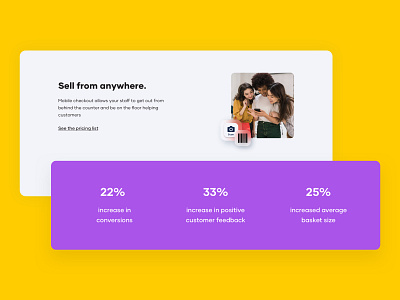
TAGR wants to reinvent retail shopping through its Scan & Go mobile self-checkout platform that eliminates lines and gives shops the conversions they’re so desperately looking for in 2022. Their idea is to create a connection that will offer the best of both the physical and digital worlds of shopping.
When we first spoke, it quickly became clear, that what TAGR needed was a website that is above all an easy-reading experience, that also offers users a smooth immersion into a retail shopping experience that’s yet undiscovered by the general public. We gave them a new website that expresses trust, clarity, and confidence. A skillful combination of a plain white background with colorful elements made for a “just-right” mix of professionalism and joyful optimism.
Designers: Karolina Ignaszak, Emilia Świątek | Developers: Adam Kubiś, Wojciech Kalbarczyk | Project Manager: Ada Ostrowska | Quality Assurance: Agata Gałka
Let’s shape & build your next digital product together:
Message us at hello@adchitects.co or visit our website.
Did you like our shot?
Press L to show us your support!
