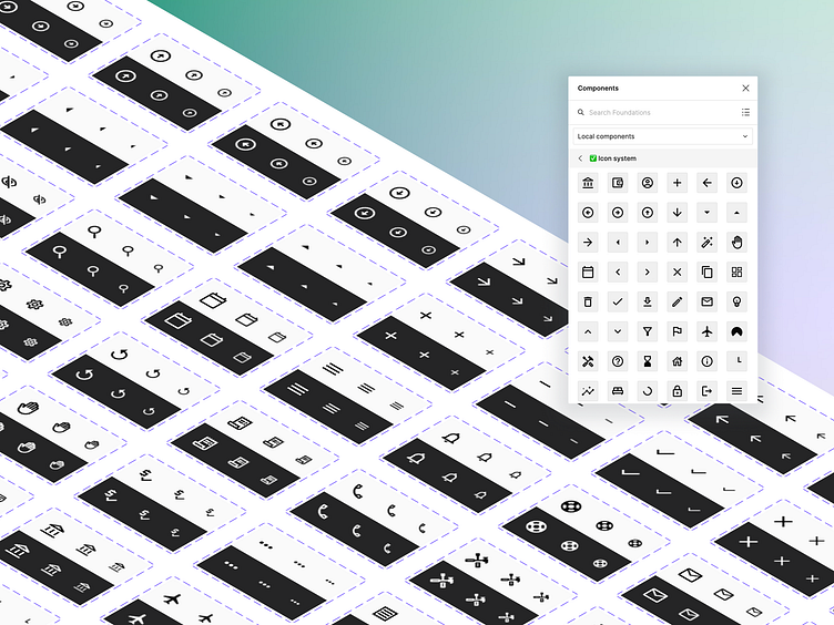
Icon system ⚡
One of our Q2 OKR's is to design solid foundations for our Capcom Design System - a component of foundations is an icon system. For now, we use Material Design icons, so it seems like it would be a simple job, right?
What made this an interesting challenge was setting up the appropriate icons within Figma to be used as effectively as possible whenever needed. The best way to do this was to create each icon as a variant of its own. This enables Figma users to hit Shift+i and bring up the Components window, while displaying all of the icon variants available.
Once an icon is dropped into the canvas, you can use the components tab to select the theme, and the size. I learnt all of this during my Design System Bootcamp at Memorisely ⚡
In addition to setting up icons as a component within Figma, we've also documented the variants, sizes, and design tokens. All as part of our foundations overhaul of our Design System.
If you're interested in talking more about GetGround, or Design Systems - find me here on LinkedIn.
We're always on the lookout for great designers at GetGround, check out our open roles here.

