K-Stream
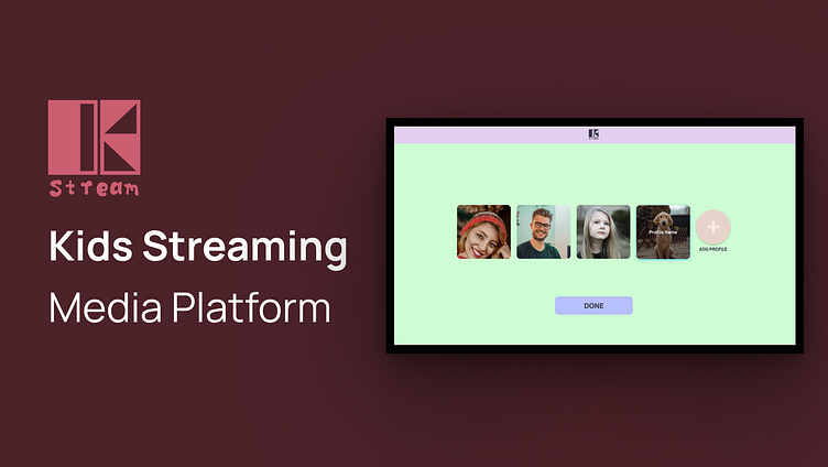
K-Stream provides a more contained environment for kids to explore their favorite shows, cartoons, movies and makes it easier for parents and caregivers to guide their journey.
Problem Statement
Younger users are having trouble transitioning from their parents profiles to their own. Users as young as 4 have their own profiles so they can access family friendly content, but sometimes it takes more than 10-12 movements on their controller to get to a hidden profile switch screen.
User Research
• The client has no initial ideas, they just know that there has to be an easier way that’s more effective for users.
• We expect subscriptions will stop dropping from households with young children if the parents and kids have a smoother experience sharing the streaming service in the home.
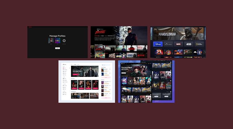
Market Research
Apps: Netflix, Disney+, Youtube Kids, Streaming Websites etc...
• Other streaming services have come up with an easier method of solving this problem, so you we have a foundation to work from.


• When thinking about designing the UI, I thought about using light colors to differentiate from adult accounts. Using lighter colors than darker colors. Anything light or pastel can help differentiate from an adult account.
• Interface is image heavy for user to click movie/cartoon etc.
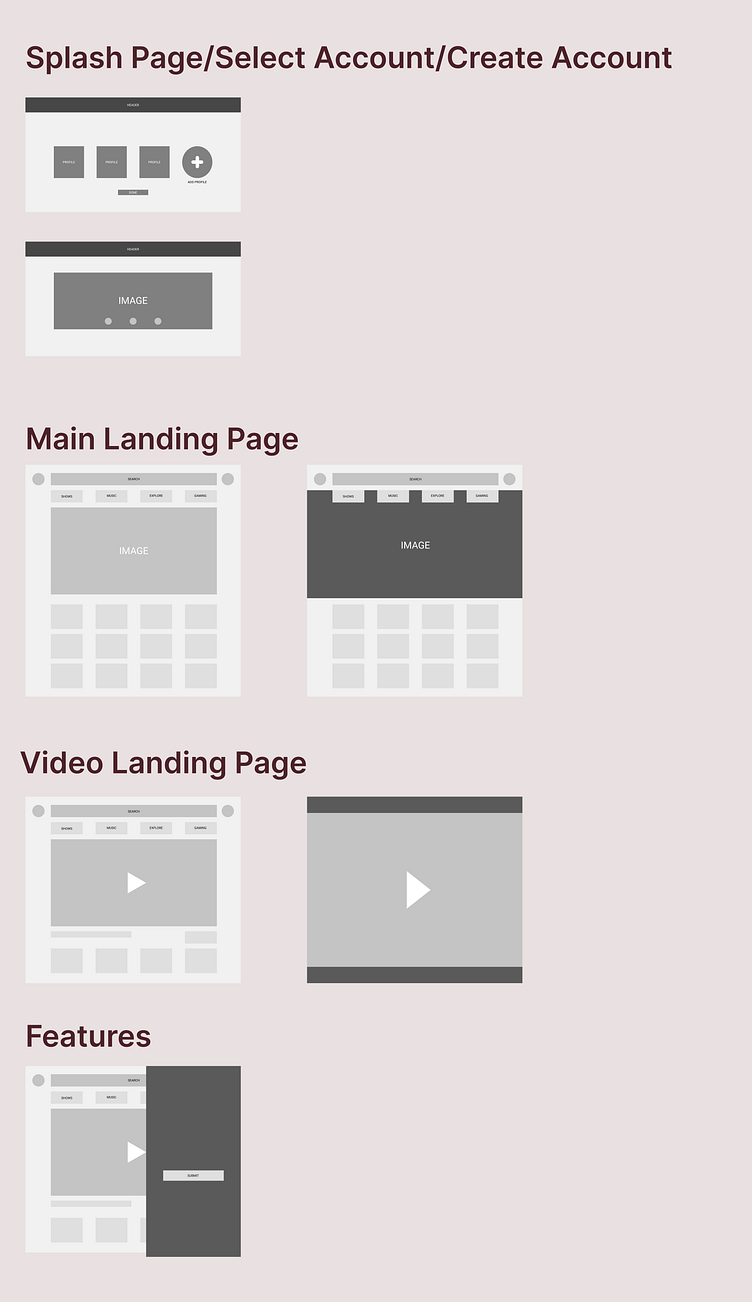
Visual Designs
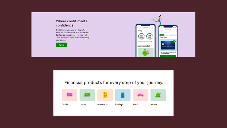
• I liked the color scheme of credit karma and how subtle their colors were. So I decided to use the same in my design or anything light or pastel like.
(***Helpful articles: https://medium.com/putnam-studio/brightening-up-a-financial-brand-680ac123c766 | https://www.creditkarma.com/ | https://www.producthunt.com/posts/youtube-kids | https://www.casestudy.club/case-studies/netflix-discovery-experience | https://netflixtechblog.com/interleaving-in-online-experiments-at-netflix-a04ee392ec55 | https://netflixtechblog.com/the-netflix-media-database-nmdb-9bf8e6d0944d | https://abdussalam.pk/project/tv-guide-app )
• Making the adult profiles darker color when hovering/selecting profile.
• Anything light or pastel for hovering/selecting children's account profile.

Outcome/Results
Doing another project in this course is repetition for me to understand the product design process again.
What I want to improve on from this project is better UI elements, creating a better functioning form for creating a profile (selecting avatar/uploading avatar)
and building out more pages with content that is needed to be a high functioning prototype.
