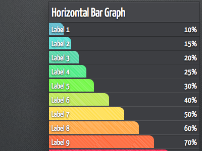
Cool & Hot Graph Two
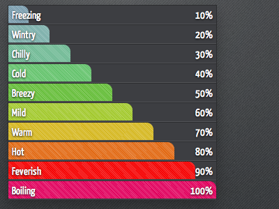
I’ve made the colours at the top of the scale a touch deeper and more saturated, while everything below 50% is at the same initial brightness.
This version is more refined than the initial, to enable a more consistent colour palette for an actual graph.