E-learning Base
Hi, dribbblers! 🙂
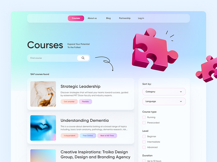
Meet our new concept! It is an aggregator site for finding courses on different platforms. The user no longer needs to search for courses on each platform - everything is collected in one place. In addition, there is a convenient filtering system by languages, difficulty levels, duration, and more.
Also, the tagging system makes it easier to find and highlights the benefits of each course. Finally, we have chosen light colors to create a radiant effect that relaxes users' eyes. 👀
The fuchsia 3D element grabs the user's attention and makes the page more interesting to look at 🧩 At the same time, we did not load the design with an abundance of elements so that the user's attention would not be distracted.
Do you like the design?🐣
Like it? Don't forget to follow Axicube! ➡️
You can also find us here: Instagram | Behance | Linkedin | Facebook
May the Force of UI/UX be with you!
