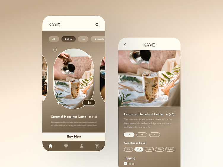
Local Coffee Shop Mobile App (UI Design)
Hi 👋🏻
Kave is a local coffee shop selling an array of coffee, tea, and light snacks.
I imagine a local coffee shop to be homey and welcoming, hence why different shades of brown are used to give that warm, cozy feeling. Plus, it also represents the color of coffee ☕️
Touching on the UX side, I designed a straightforward ordering process where users could immediately see the menu on the homepage. For specific findings, users could use the search button 🔍 on the top right corner OR click on the menu tags. Lastly, the CTA is big and bold to make it easy for customers to recognize. The CTA button is also purposely placed on the bottom for an easier touch point reach for a swift purchase 🛒
Instead of a landing page, I created a mobile app as part of my Dribbble Product Design course.
Any thoughts on the UI? Feel free to comment 😊
And don't forget to press "L" if you liked it 🤍
Thank you ✨


