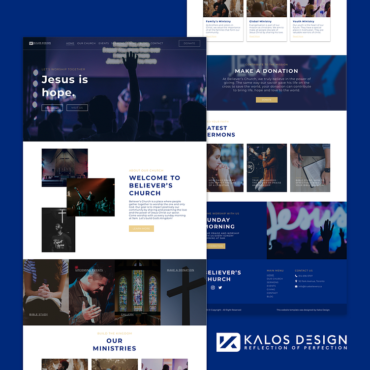
Church Website Design
Hi everyone 👋🏾
How to make your message clear to your visitors when they get on your website? How do you make sure that they follow the perfect path to conversion when they are looking at your site?
One of the best way to optimize these variables is by establishing a logic & consistent visual hierarchy. Visual hierarchy is what regulates and establishes contrast between elements in your design. Having a strong visual hierarchy helps the viewers to know in what order he should analyse all the elements and informations on your page in order to make a decision on wether he wants your product/service or not.
In other words, better visual hierarchy equals clearer design & message which can improve your conversion.
Let us know what you think about this church website design in the comment section. ********** Please don’t forget to like & follow to see more of our work! 😊
===============================================
We are available for new projects - info@kalosdesign.ca 📩
Follow Us On👇🏾 Instagram | Facebook
Thank you! 🙏🏾

