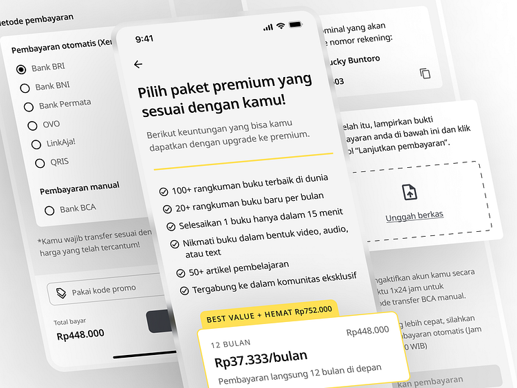
Improving SekilasAja! App Subscription Payment Checkout Flow Exp
SekilasAja! is a platform to read summaries of business, investment, and self-development books. The product itself solves the problem of Indonesian people who do not like or have difficulty consistently reading books with these topics which tend to have thick book pages and heavy material.
In this passion project, I conduct a redesign for their product subscription payment flow where I made a 228% improvement to the experience from the existing UI based on the SUS method for usability testing, and with this redesign, it can be one of the ways for SekilasAja! to increase their MRR (Monthly Recurring Revenue).
If you want to read the complete version of the case study, click on this link to access my portfolio:


