The Tea Admirer packaging
The challenge
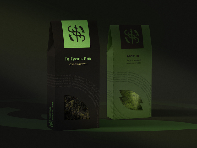
The store sells tea and tableware for ceremonies. Philosophy: the veneration of traditions and culture, the education of the strength of spirit and character, love and respect for tea and the traditions of the East. The identity should give a sense of naturalness and belonging to the community.
The solution
The logo is based on a myth: a carp that overcame a waterfall. The legend reflects perseverance and fortitude. The waterfall crosses the sign diagonally. In the center of the logo is a katana as a symbol of oriental traditions and an inner core. The silhouette of the leaf in the center translates the tea theme and naturalness, the deep green gamma supports the semantics. The combination with dark graphite color gives a mystery and a sense of belonging to the community. The front and the sign are made in a geometric style close to hieroglyphs. The symmetry and balance symbolizes harmony with oneself and with the world. A smooth text pattern makes the brand more open.
Full case you can explore on my Behance! Feel free to appreciate and comment!
Contact me for discuss your project on Telegram
Or mail me alyona.ivanushkina@gmail.com
