Starbucks Application Redesign
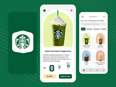
An amazing and minimalistic view of the Starbucks application which is redesigned both in light and dark modes respectively.
I observed that the mobile application UI for Starbucks was not so attractive in my point of view. Hence tried giving it a shot with a simple and neat design such that it not only attracts the users but also gives them a better and more pleasing user experience.
