Baroness Logo Mock Up Small

Elegant logo for boutique firm
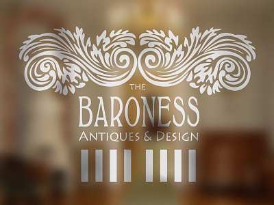
It went through different stages. First there was the idea of using this antique looking decorative elements. Originally, there was a middle motif too. But somehow it looked boring and way too traditional. Then I made it asymmetrical, but it did not work. Then I started to tweak the top, modernizing the old swirls feeling that it was coming together finally. After adding the letters, still thought something was missing, so added the column part. Some more tweaking and it became airy.