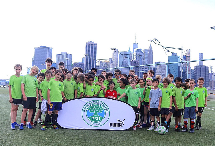
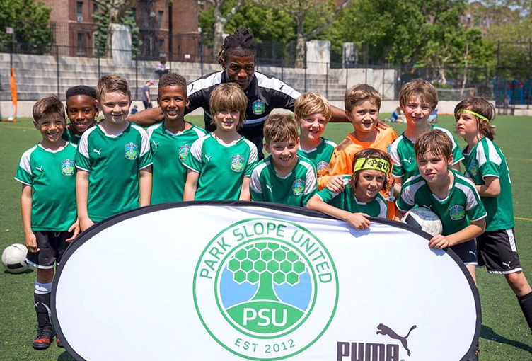
Park Slope United
Founded in 2012, Park Slope United (PSU) offers comprehensive soccer education together with a nurturing community to inspire young players with the confidence and character necessary to become excellent soccer players and grow into healthy, well-rounded adults.
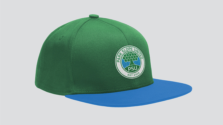
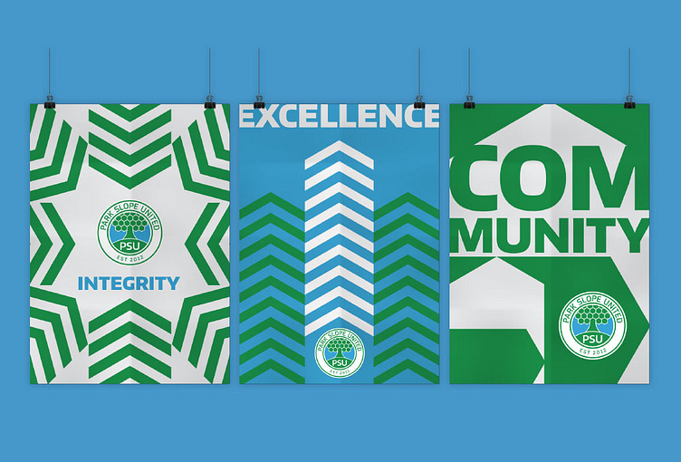
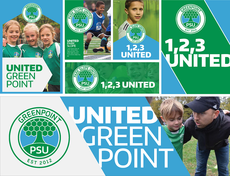
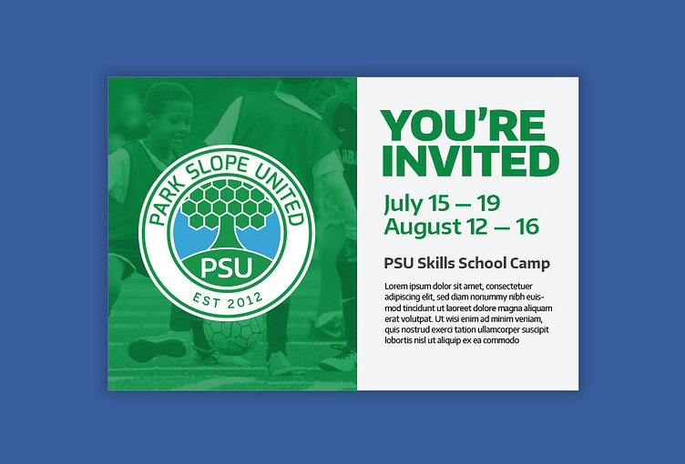
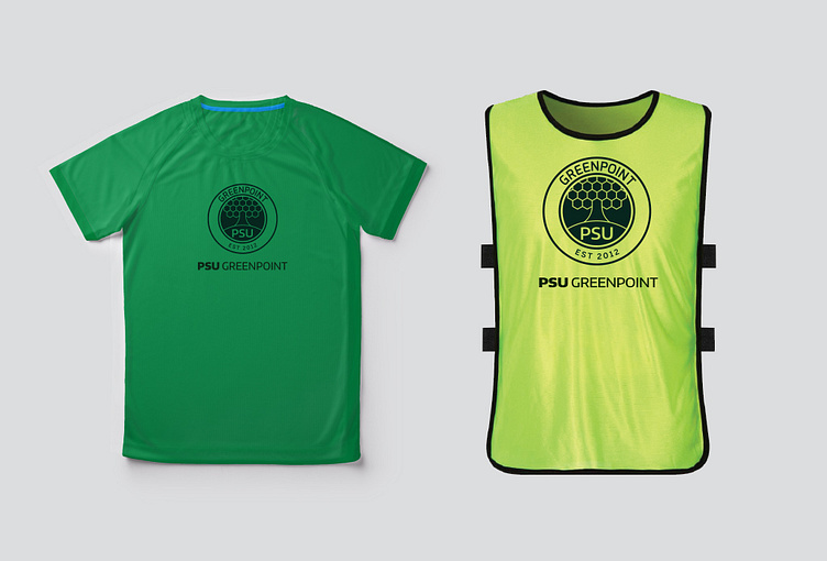
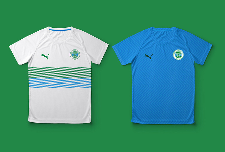
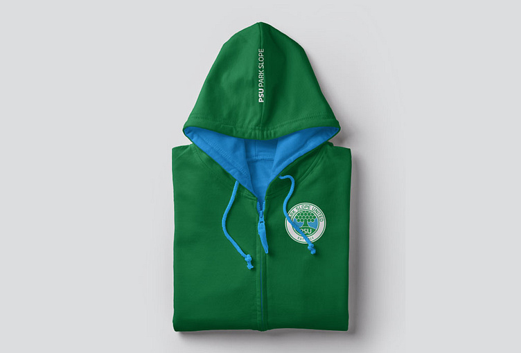
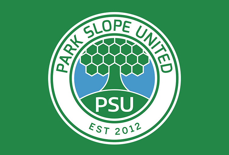
The tree is their traditional symbol of Park Slope United which represented the area in their old logo. I've been asked to refresh their visual identity including their logo, visual elements, color palette, typography, photography, iconography and illustration. I reworked their logo into something that is more modern, simple and legible in small space. I used the pattern of the soccer to create the tree symbol and the circular shape of the logo represent the shape of the soccer. The soccer pattern also activated as a visual device through out the brand into a flexible visual system