Bark Avenue -- Caring for your pet in the city
As a part of Dribble’s Product Design course, I worked on designing a dog walking app from the research to prototyping phases.
We were given the following challenge:
Dog owners sometimes need help caring for and walking their dogs. Create a service to connect dog owners with dog walkers. Consider how we can help dog owners trust their dogs are in safe hands.
Final Prototype and Design
This was a fun project and based on user testing I conducted, my prototype successfully met the challenge. Users commented on how my app brought them joy, conveyed a sense of friendliness and trustworthiness, and they were able to successfully complete the task of finding a dog walker.
“This app is really cute and and the steps to find a dog walker seem clear and concise to me”
Read below for in-depth details of the design process
Read More: My In-Depth Process
Problem Statement
I developed the following problem statement for the app:
Ashley is a busy working professional who often travels. She needs to be able to quickly find a trustworthy and knowledgable dog walker who can walk and care for her dog, Oreo, while she is away.
Research
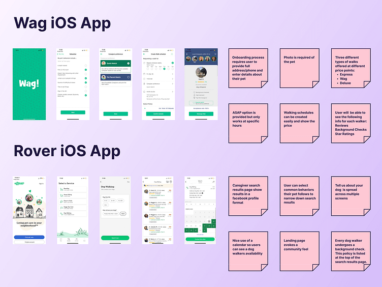
Competitive Analysis
I closely analyzed existing dog walking apps to understand common user flows, design conventions, and patterns.
Interviews
Next, I interviewed a few individuals who own dogs and are interested in dog walking services.
A key takeaway from the interviews was that it is critical for the app to convey a sense of trust. People love their dogs and feel anxious about how well their dogs are being taken care of when they are not around.
“I am not sure I want to use a dog walking app because I am not comfortable with strangers caring for my dog when I am not around.”
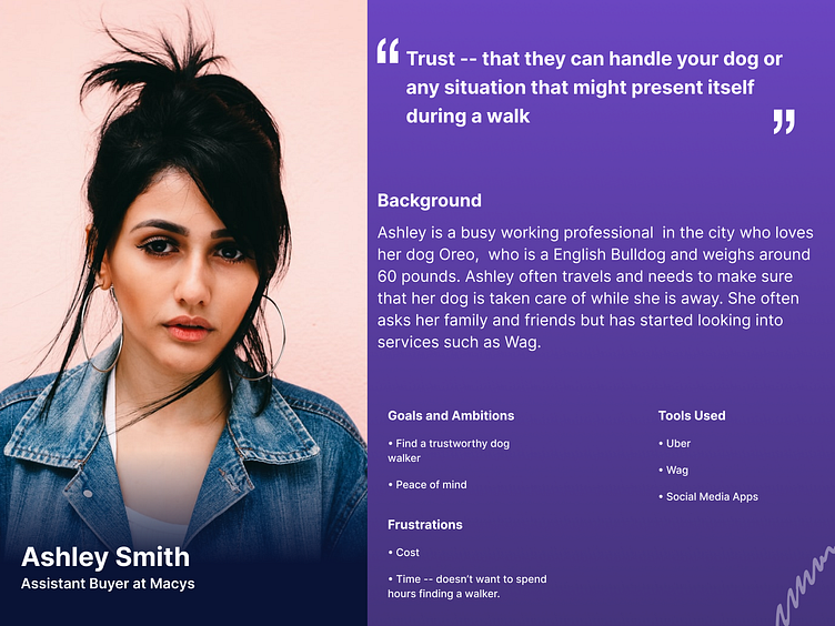
Persona
Based on my interviews, I developed a persona that helped me visualize the type of user I am designing for. A dog walking app can be used by many different types of users with many different needs. For example:
Elderly people who need assistance with taking care of their dogs
People who have disruptive dogs and need help with establishing a routine for their dog to let out extra energy.
Busy working professionals
For this project, I decided to focus on busy working professionals because my interviews made me realize that working professionals would really benefit from a dog walking app since they often do not have the time to provide individualized care for their dogs.
Using information from my interviews, I further narrowed in on my user by adding in the following key characteristics:
Young
Lives and works in New York City
Travels often
Values trust
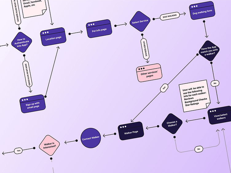
User Flow
To stay organized and keep the overall big picture in mind, I created a user flow that covered the steps from the user signing-in to payment. My user flow helped me determine areas where decisions and actions would be made by the user, made sure I wasn’t missing key steps, and formed a foundation for creating screens for the app.
For this project, I focused on the on the onboarding and searching for a dog walker subset of the overall flow.
I innovated in the user flow by providing users with the option to be quick matched with a walker or if they wanted to browse all available walkers. Providing the users with these choices meets the need of my persona — a busy working professional — because it provides an opportunity for users to save time and make less decisions.
Wireframing
I spent time exploring different screen layout options for my app during the wireframing stage.
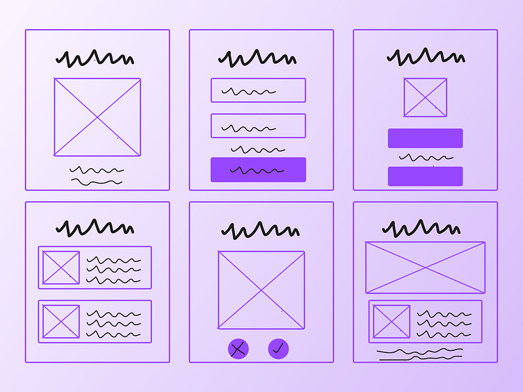
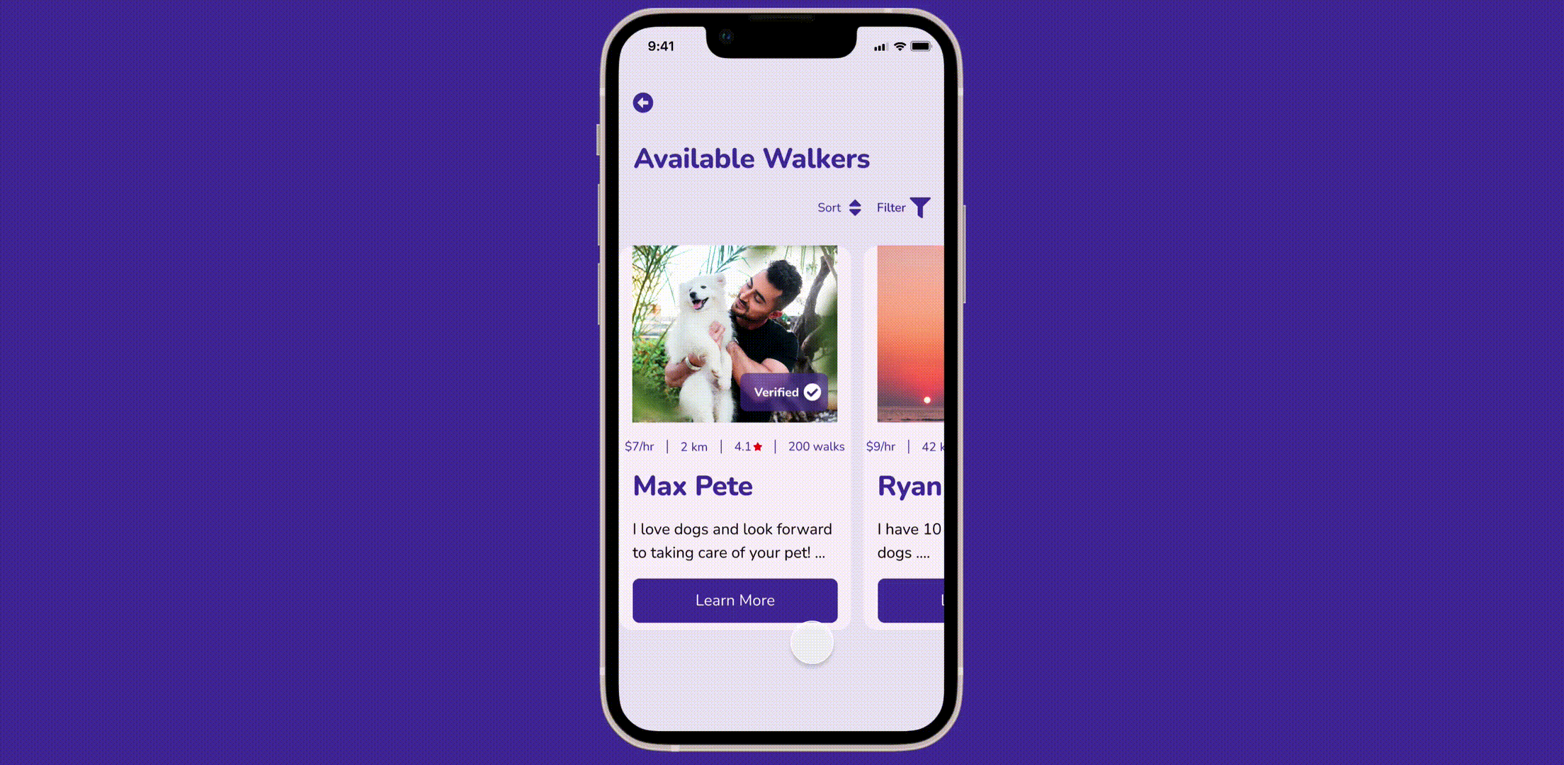
At first, I struggled with coming up with mobile friendly layouts. For example, on the search results page for walkers, I initially just had all the walker information stacked.
However, after doing research on common mobile UI patterns, I realized that this layout would require too much scrolling for the user. I then decided on restructuring the search results page to have a swipe-able card layout because cards are effective at displaying information in a simple layout, are designed to be swiped with ones thumb, and make the process of discovering information more interactive.

UI Design
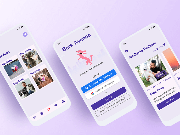
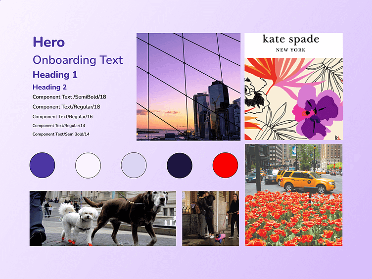
The most exciting phase of this project was developing the UI. I spent a lot of time searching for inspiration and also using my imagination to create a brand for my app. I took my persona of a “young busy working professional” and made it more targeted — young workers living and working in New York City. This young professional works for high end brands in the city, has a penchant for design and doesn’t mind spending money on services that make their life more convenient. I decided to name the app “Bark Avenue”
On my vision board, I showcase images of dogs in the city, along with design inspiration from brands such as Kate Spade.
Color
I chose a color palette of pinks and purples to convey a soft, fresh, trendy, and unique feel.
Typography
I selected the Nunito typeface because its rounded terminals makes it feel modern and approachable. I decided to stick with one font-face to keep the design clean.
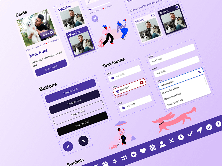
UI Components
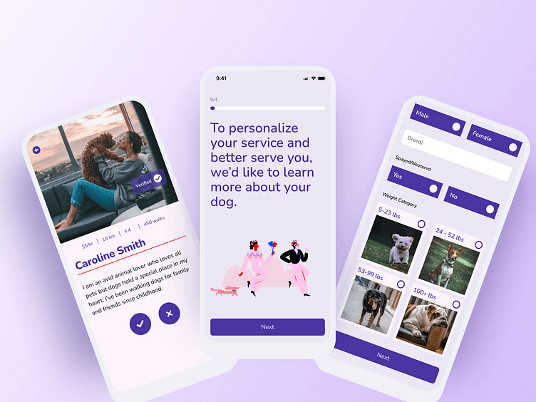
I created two button styles — one that would serve as a call to action and one that is for secondary actions.
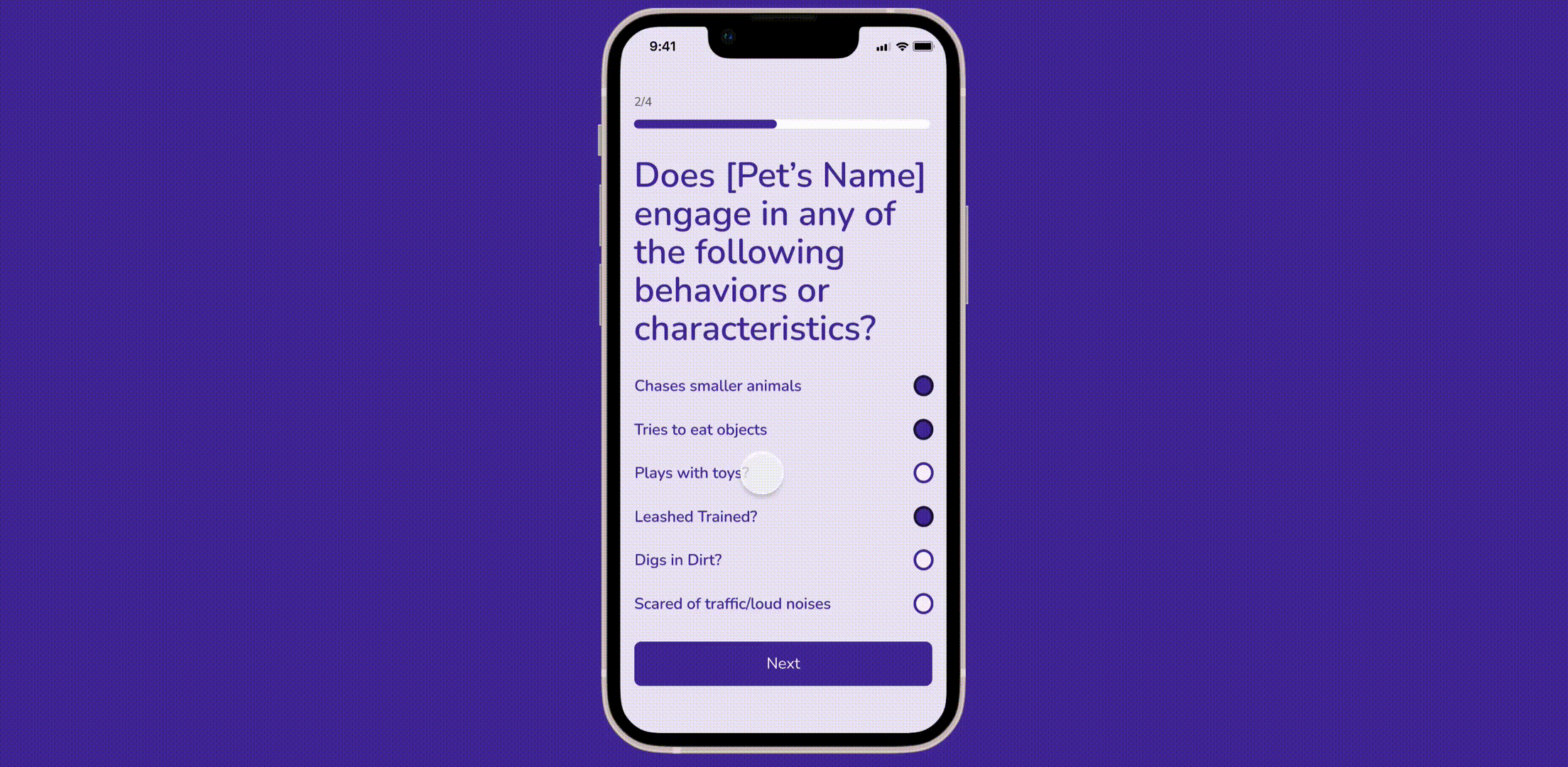
I also added mobile friendly form components such as large radio button fields and utilized cards to display information in an interesting yet compact way.
To create a sense of trust, I incorporated elements such as verified badge, and used tabs to organize information about the walkers such as their skills, reviews, etc in a digestible format.
Imagery
I found illustrations that went along perfectly with the vibe of my app. These illustrations are aesthetically pleasing, modern, and make the app inviting and fun.
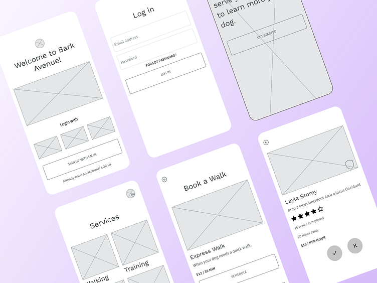
Prototype
Bringing my screens to life via the prototyping tool in Figma felt very rewarding. I was able to create a prototype that allowed users to walk through the onboarding to searching for a dog walker steps of the app.
The interactions I created provide a pretty realistic idea to the user as to how the app will work. I tested the app on users and received positive feedback. Users commented on how the app felt inviting and trustworthy — one user was in particular impressed with the use of the verified badge.
Another user commented on how he liked how the onboarding process made the process of entering information seem more manageable and exciting.
A user also commented on how they enjoyed swiping through the dog walkers on the search results page because it felt fun and was also practical.
Testing
The goal was to see if users would be able to successfully send in a request to book a particular dog walker — and all users were able to accomplish this.
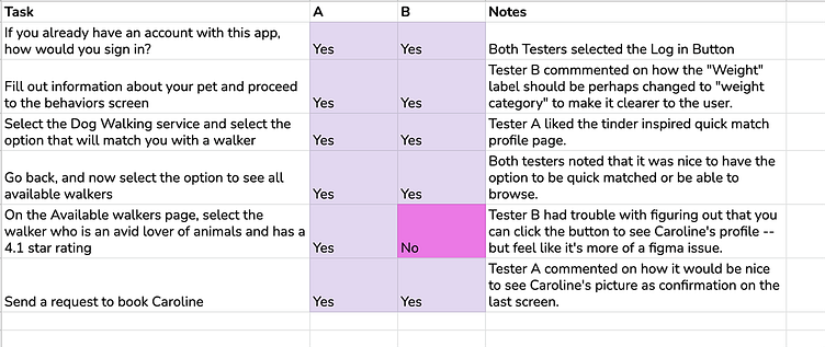
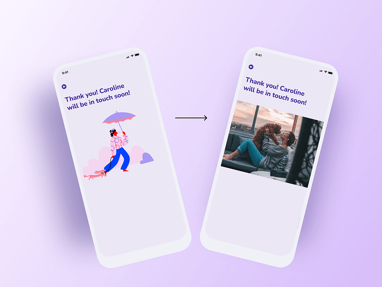
I received helpful feedback on my designs when I was testing my users. One feedback I found interesting was a user commenting on how the final screen of the app (the “Thank you” screen ) showed an illustration of a person walking a dog, when instead he said it would be more helpful to see a picture of the dog walker that one is requesting.
The user said that he believed seeing the dog walker’s picture on the final screen would serve as a confirmation to the user and make the app feel more personalized.
I revised the “Thank you” screen to include the picture of the dog walker and tested it with another user, who commented on how including the dog walker’s photo helped make it very clear who the user was requesting to book.
Summary
Designing a dog walker app was a fun and insightful project. I felt a little hesitant when I first heard of the project idea — since I am not a dog owner and the app is not something I would probably use. However, the project taught me that I can design a successful app even when when the subject of an app is not of relevance to me by engaging in the design process and also using my imagination and creativity.
There are many other user flows to explore and build upon for this app. For this project, I focused on the on the onboarding and searching for a dog walker flows. Based on user testing, the designs I created for this segment of the project are successful because they accomplish the goal of allowing users to be able to book trustworthy dog walkers easily.