Case Study: Dogwalk App
Journey is a fictitious dog walker app that includes dogwalking, house sitting, and daycare services. It has an appointment reminder, tracker, messenger, pet sitter reviews, and lists sitters that host from multiple locations!
The Problems
Initially I interviewed dog owners that I know for their experience using dog apps. Surprisingly none of them use one, and here are the reasons:
1) They don't know whether they could trust the sitter since they are strangers, where would the dogs be, and how would they be treated
2) Whether dog will get along with the sitter
3) Whether the sitters are doing their job
Possible Solutions
1) Include pet sitter information that make them valid sitters, such as personal verification, pet training certification, experience at handling dogs, profession, languages (for communication), response time, etc.
2) Pet owners could message the sitters and communicate through them whether they would have any issues with the dogs.
3) To track if sitters are doing their job, there could be a feature where they see where the sitter is on the map.
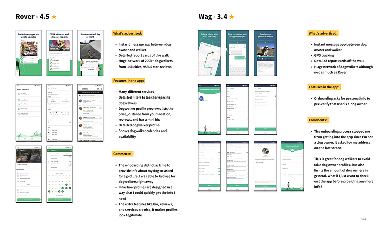
Market Research
Before drafting ideas for the wireframes, I did a short analysis on comparing different dogwalk apps that exist in the app stores today. I chose the two that are most popular and compared the flow.
I adopted the idea of adding a "skip" option from one the apps since that allows the user to skip over signing up, and would give them a chance to explore the app first before providing more information.
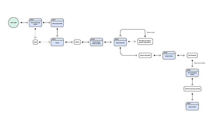
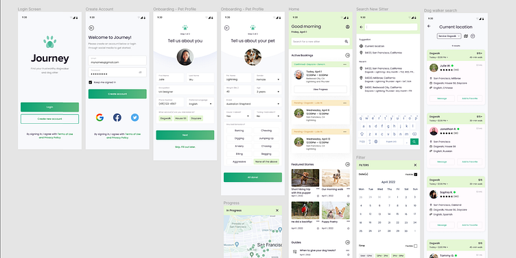
User Flow
A few highlights about this flow:
"Skip" option after sign up
Option to choose between the different services at search
Filters are specific to the type of service selected
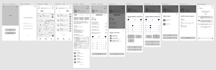
Low Fidelity Wireframes
I grabbed ideas from the apps that I explored from market research and put together some screens.
Moodboard
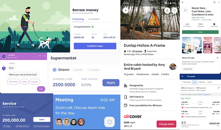
I hopped onto Dribbble to find some color, typography, and component inspirations! I also downloaded a few service booking apps that I found could be helpful for new ideas.
I was really drawn to card components since booking apps could be content heavy, where search results would need to be easy to scan through, and be providing enough information to get users to filter through them.
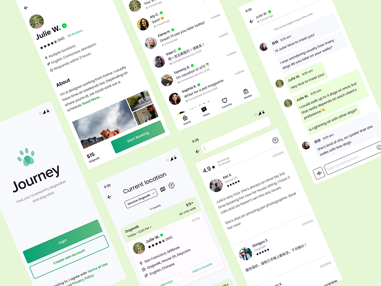
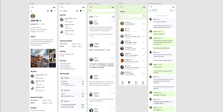
High Fidelity Wireframes
I spent quite a lot of time coming with ways to organize information within card components. Looking back at components in existing booking apps definitely helped.
I did user testing with some friends, redesigned some components, and then went back to testing for the final time.
Prototype
GIF prototype coming soon!
Final Thoughts
I'm satisfied with some screens, but components could be improved. Simplifying some card components could improve the experience, making digesting content less overwhelming.
Onto the next project!
