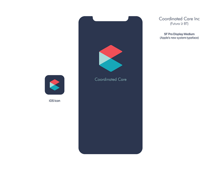
Coordinated Care rebrand concept
I wanted to update Coordinated Care's branding while still recognizing their starting point. I designed a new mark that both represented the "C" letterform and their mission to introduce new structures into the healthcare industry. I kept their Futura logotype and iconic blue-green but added a reddish-orange to the palette to bring a sense of urgency -- the healthcare system, especially in rural areas, needs to change quickly in order to ensure quality, affordable healthcare is available to all Americans.
More by Jon Racinskas View profile
Like
