Kompas ePaper Interaction Redesign
Hello everyone, this is a redesign of Kompas ePaper interaction 📃.
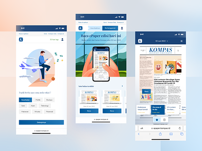
Reading the digital newspapers can be frustrating, users should zoom in/out repeatedly to reading the information since newspapers have a lot of small text and subheadings. I researched a UX and designed a UI for better interaction so users can read newspapers digitally more accessible. Check the presentation on my Behance and the case study on my Medium.
---
I available for a new project. Lets talk!
Connect with my team:
