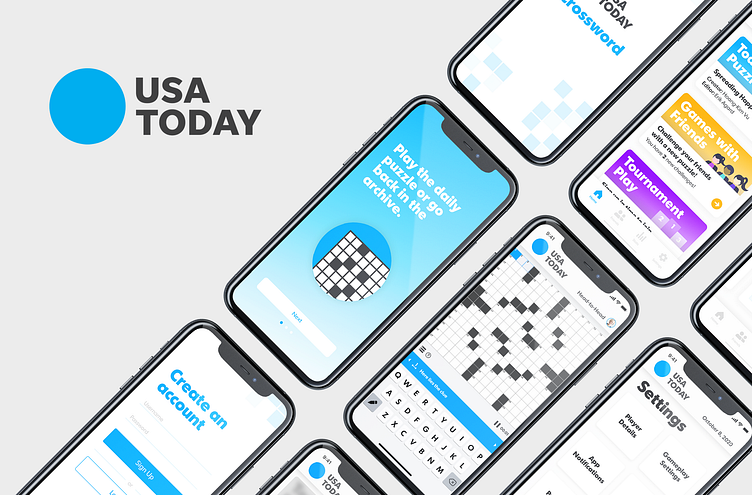
USA Today Crossword app: An exploration
Role: UX Design, UI Design
Timeline: Winter 2021 | Tools: Adobe XD
Overview
The crossword app is one of many puzzle games offered by USA Today. The puzzle can be played online or in app via mobile phone or tablet. An overall visual update to the app opened the door to provide gameplay updates based on user feedback, and the introduction of a new feature that allows users to challenge other puzzle solvers to a head-to-head timed solving exhibition. Lastly, a new onboarding journey allows new and existing users to view new features and updates.
My Role
As a puzzle solver myself, I decided to execute a self-directed learning project creating the design end-to-end.
Challenges
As a user of the app, I had a first-hand experience on some the problems users were running into. Outside of this, I researched through reviews from the app store to try and understand other user pain points. A self-directed challenge I assigned myself was; to increase user engagement.
Through reading reviews, a lot of the gameplay problems users were having revolved around usability. The location of buttons and the configuration of the keyboard were a popular issue for users.
For the self-directed challenge of increasing user engagement, I prototyped a new feature of challenging other puzzle solvers to a timed solving exhibition. This feature could also be monetized in part with the existing subscription package. The feature could be rolled out in a free trial period to attract new subscribers.
Method
Based on the user reviews and feedback I created a lo-fi version of the app. From there, I built out a hi-fi version of the app that includes; an onboarding process, dashboard, and a few landing pages. Prototyping followed.
Deliverables
Hi-fi mockups and clickable prototypes. Delivering a clickable prototype would dramatically cut down time for the development team, as they could see transitions from page to page and items interacted between actions.
Takeaways
Throughout creating this project, I gained a plethora of knowledge that included; improving my technical software skills, doing simple user research, empathizing with the user, and how updating visual can give way to introducing new features and obtaining other business goals such as improving monetization.
While I did learn a lot from this project, I would do a few things differently moving forward. Including quicker iterations of lo-fi mockups, such as sketches, and I would also try and get this design in front of more people to do more user testing, as only a few people experienced the design throughout the process.


