Case Study - Artículos Mexicanos
Project Goal
The Mexican Constitution has undergone over 700 updates over its 105 year history. Currently it is simple to find the very first and most recent content for the Constitution's 136 articles but becomes very difficult if you're interested in any of the content in between.
The goal of this project was to design a mobile experience which will allow users to easily access the potential many different versions of articles within the Mexican Constitution
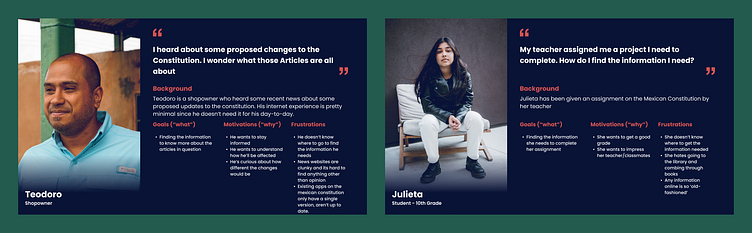
User Personas
The personas I defined for this project focused on the use cases the average Mexican citizen would encounter a need for this type of application.
Visual Designs
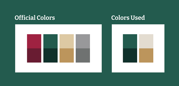
The foundational design decisions for this application were inspired by the official Mexican Government's style guide (found here https://www.gob.mx/wikiguias/articulos/manual-de-identidad-grafica-2018-2024)
A slightly modified portion of the official color palette was used. Green was chosen as the primary color due to it typically being used in that manner throughout existing government web applications. The light tan was additionally lightened due to it being used primarily as a text backdrop.
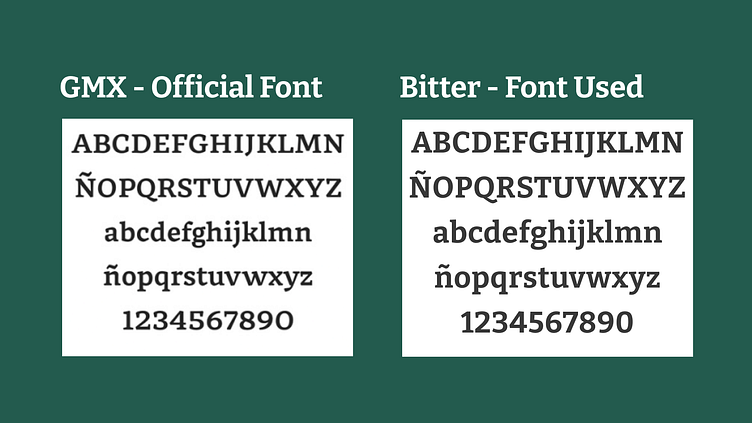
The typography was also inspired by the official style guide. The Mexican Government commissioned a decorative header font named GMX which is regularly used in non-web media. Due to not being able to access it I found Bitter which has similar characteristics. I chose Open Sans as the body text font for the application due to its readability, something I believe the official body font lacks.
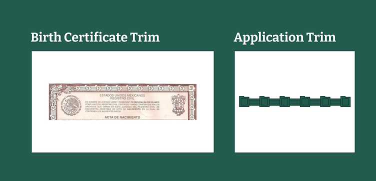
Additionally, due to the nature of the application I wanted to find a way to incorporate a visual reference to the Mexican Government. I found the candidate for this in the borders of Mexican birth certificates.
After some experimentation I was able to land on a simplified version of this border trim for decoration.
Application Design
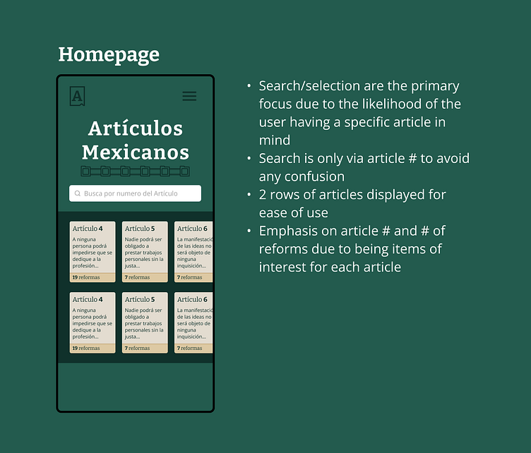
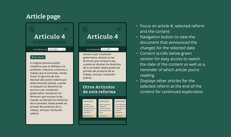
The application has 2 primary screens of interaction, the Homepage and a page for viewing Article content. Although I had originally planned for additional screens I decided to limit the scope of this project due to the very targeted use cases of my personas. Doing this allowed me to greatly simplify the end result and provided a targeted experience.
Reflection
Overall I feel as if the most important outcome of this project was experiencing the impact of understanding the user. This project initially had around 5 or 6 screens and significantly more functionality but they continued to be scaled down due to asking these two questions:
What is the value this application provides and does this feature support that?
Would the user actually use this feature given the use cases defined in the personas?
At the start it was very difficult for me to remove features but as I became more comfortable asking these questions the process became much smoother. I'm happy with where this project ended up for an MVP and over time may migrate my discarded features into an application for research focused users.