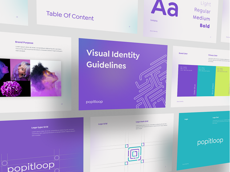
Popitloop - Visual Identity Guidelines Full
Hello Everyone!
In this post, I wanna show u my exploration of the logo, logo animation brand guidelines, brand application, and social media. The name of this brand is Popitloop.
I hope u enjoy it. Check this out!
Popitloop Logo
In the logo I highlight the word "loop" with that I represent it like a labyrinth, other than that I use the letter "O" to be the shape of the logo. The use of colors that I use is to use bright colors with the aim that the logo can look more fun and modern.
Logo Animation
Brand Guidelines of Popitloop
The style used in the popitloop brand guidelines takes a minimalist, colorful, and gradient style. This is in accordance with the impression that this logo wants to show.
Brand Application of Popitloop
The brand applications that I aim for are letters, business cards, and merch. The design that I want to highlight is the use of lines in the logo, which are then used as elements in every brand application.
Social Media of Popitloop
The social media look used in this Popitloop brand uses a minimalist style and for the use of colors I use pop up colors to make it look more fun and modern
What do you think?
Hope you like it, Feel free to give feedback. And don't forget to press the love button if you like 😊
For Business & Inquiries: hellohatypo@gmail.com
Follow Us :
UI8...


