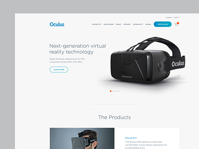
Oculus Redesign
After spending the last few months exclusively on client work (which I'm hoping to show very soon), I finally had a few free hours and felt the urge to explore a new visual design language for Oculus.
My main goal here was to create a clean and minimal design for their homepage that was better suited for a modern consumer product. This is just a fun exploration of what a "nest-ified" Oculus site could look like.
More by Vivek Venkatraman View profile
Like

