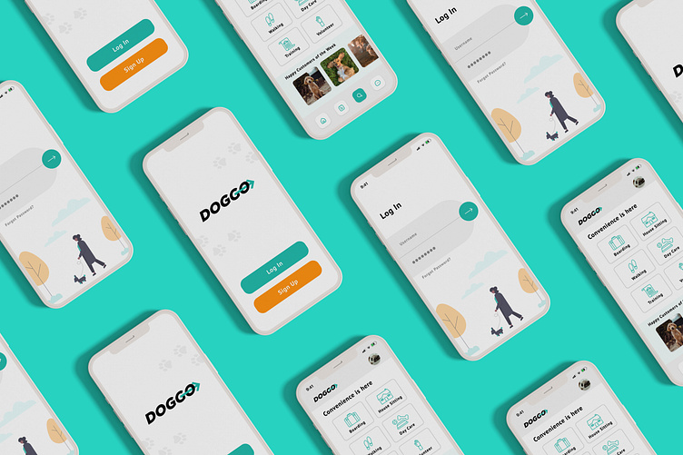
DOGGO - Dog Walking App
DOGGO
I designed this app to be a quick and simple way for dog owners to connect to local dog walkers who they can trust. I wanted to keep the layout clean and easy to navigate.
Findings
I interviewed dog owners through social media and I learned their biggest concern - trust. They needed someone they could rely on who would go above and beyond for their fur baby. I also discovered that a lot of dog owners prefer communication through text instead of calls, and that they loved seeing pictures of their dogs while they are being cared for. This research helped me develop ideas for how I would make the owners feel like they could hand off their pets without any worry.
User Persona
The research I collected help me create a user persona I thought would fit the potential users of this app. This persona formed the decisions I would make for user flow and how it would work effectively.
User Flow
I wanted the user experience to be a simple one. The search page would have multiple decisions of what the walker is looking for, and by clicking on the button they would easily find available walkers or carers near them.
Wireframes
The next step was to roughly figure out how I wanted the frames to look. I tried to stick to my original idea of keeping things clean so that there would be no confusion as to what the user was doing. I knew from the beginning that I wanted a nav bar at the bottom so that it was within reach if someone was holding their phone with one hand. This would make it easy to switch over to a different page. After some feedback from a mentor, I realized some pages that go deeper into the dog walker search did not need the nav bar. Removing the nav bar when needed gave more room for information that the user would need.
Visual Design
Sticking to a limited color palette was key to making the app prompts and buttons easy to identify. This makes it less likely for users to give up on their search before finding a dog walker. I stuck with flat illustrations and simple icons to help with the overall aesthetic of the app. I also made a feature at the bottom of the main search page where dog walkers could upload pictures of recent dogs they took care of to show they were happy and hopefully further help the owners feel a sense of trust.
Knowing that the users would be most worried about trust, I gave the dog walkers star ratings that would change based on the reviews they were given by other dog owners. These reviews would also be shown directly under their profile for the user to see.
What I Learned
This was my first UX/UI project ever, thanks to the Dribbble Product Design Course. For my next project, I will add more features for users to discover and help their decision making which I think this app lacked. I look forward to learning more about product design in the future and making my designs much stronger for the best user experience.


