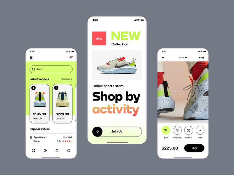
Latest models app
Hey all,
The last of our fantastic projects is such a bright online store with sports shoes. The store’s primary focus is the cool neon green color and style of iconography and buttons. We do not tire of repeating that the visual part of the design and how it is perceived in the end is very much related to the product photos that the client provides us. In this particular case, it was exciting to work because all the image and video material was at the highest level and very creatively shot.
We used best practices to help the buyer navigate the application regarding UX. We made the UI part from scratch — from the brand book to patterns and visual elements, such as icons specific to this brand. This online shoe store’s biggest problem was developing a particular system of categorization of shoes by weather and functionality. That’s what the client wanted, and we thought about how to implement it for a long time. The solution was not found immediately, but it became almost ingenious — for each icon, there is a corresponding category. It is clickable. And when you as a user choose waterproof shoes — you are shown all related models. This is implemented completely unobtrusively, and just below the product photo are these icons. This makes filtering more convenient and allows you to find your target search faster.
How do you like such decisions?
We were interested and wanted to work even harder on such projects.
Do you have something for us?
⭐️ ⭐️ ⭐️
Art director — Taras Migulko
Design — emote.agency
⭐️ ⭐️ ⭐️
Awwwards | Behance | Live website
We are open to new projects 💌 hey@emote.agency


