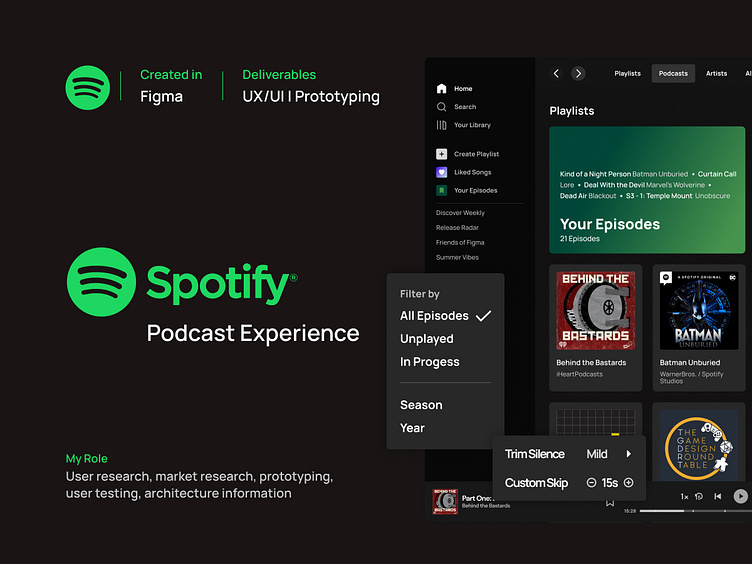
Spotify - Improving the Podcast Experience
Introduction
The audiovisual world keeps expanding every day, bringing more immersive experiences through music, audiobooks, podcasts and videos. Depending what you are looking for you can find a dedicated app, or, in the case of Spotify, you can find all of those auditive experiences in one place, making it easy for the user to follow what they like and find new things.
As a Spotify user, I noticed the music and podcast experiences are very different and not equally intuitive. Spotify has an amazing experience when it comes to music: users can manage their playlists, share them with friends and get suggestions based on their likes. However, when it comes to podcasts, Spotify lacks the filtering features that makes finding new songs and artists such an easy process and managing their favorite shows and episodes is not as effortless as managing their playlist.
So I decided to take on the challenge to find possible ways on how to improve the podcast experience for everyone without altering too much the already familiar patterns established in the app.
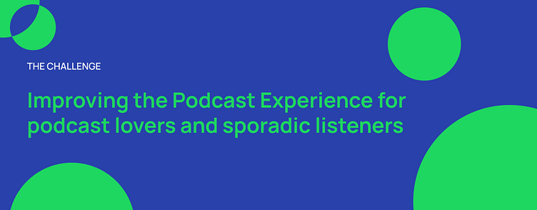
The Problem
How to boost the listeners’ experience to encourage them to listen to the podcast again?
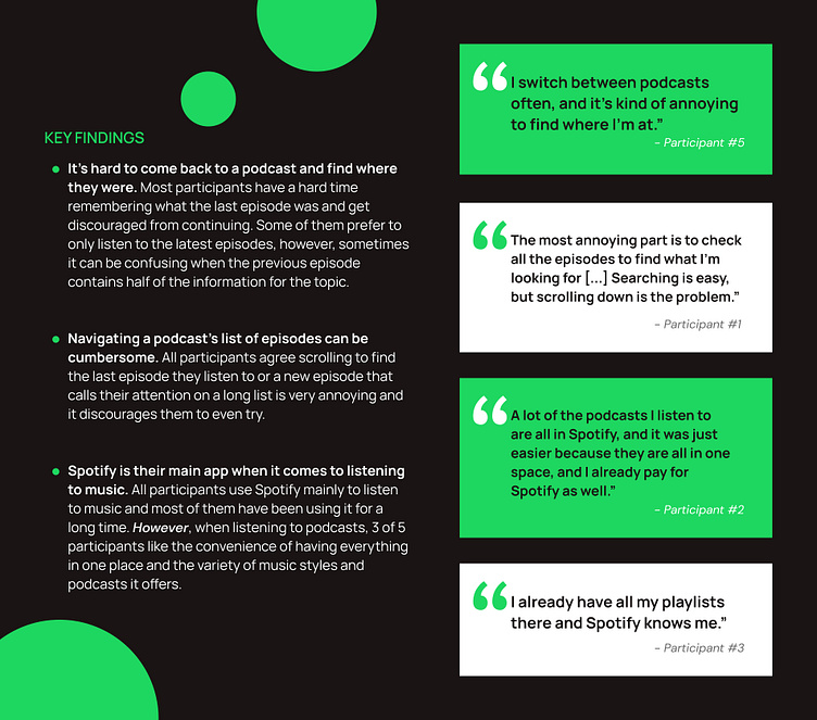
Podcast listeners like how Spotify suggests them new shows based on their listening habits, however, it’s hard to come back and manage the podcasts they are following as well as finding which was the last episode they listen to.
It would be ideal to make the search easier and faster to avoid discouraging listeners to check older podcasts.
Research
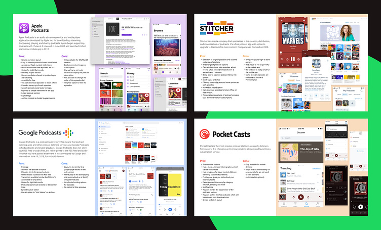
Market Research
How do competitors target this issue?
To get a better grasp of the market and what makes a good podcast experience, I conducted a desktop research and competitor analysis, focusing mainly on apps dedicated to podcast streaming.
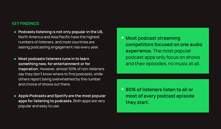
The podcast audience has been growing exponentially in the past few years and it is projected that it will keep growing in the next ones, so it is important to understand how big the reach and the audience of podcasts currently is, how the audience tends to consume these shows and what kind of podcasts listeners prefer to tune in for.
User Research
Understanding the listeners and their podcast habits
To gather more information about the listeners and their podcast habits, I conducted 1-on-1 user interviews with five participants.
I asked them some questions to understand what apps they used for audio streaming services, how likely they were to use Spotify for music and podcasts, what their podcast listening habits are and what are their frustrations when it comes to catching up with the podcasts they follow.
Defining the Problem
Persona
Meet Xavier
After a long desktop research to gather some information about the audience, interviewing users to understand their listening habits and conducting a Feature Comparison between Apple Podcasts, Google Podcasts, Stitcher, Pocket Cast and Spotify, I was able to create a user persona and their journey map.
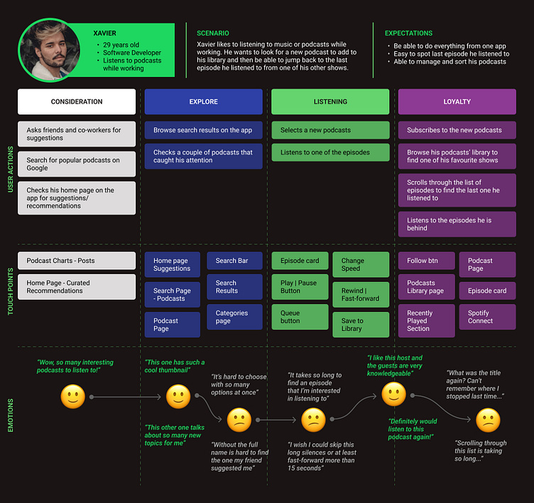
For this project, it was important for me to understand what the pain points for my persona were while using Spotify and how it emotionally affected any part of the experience when listening to podcasts in order to tackle those issues and improve the user flow of the app.
Based on my research, I believe users need a better, more intuitive way to find podcasts they may be interested in. With that in mind, my approach will be to improve Spotify’s sorting and filtering options.
User Flow
Improving the filtering options for a better experience
Spotify can be used in different devices and operating systems, however, I decided to focus only on the desktop app as this instance seems to be lacking on features and possibilities when it comes to podcasts listening.
A common element I noticed while doing my research was the lack of sorting options in Spotify, which could help narrowing down the options and boost the experience when finding episodes or new podcasts.
Solution Ideation
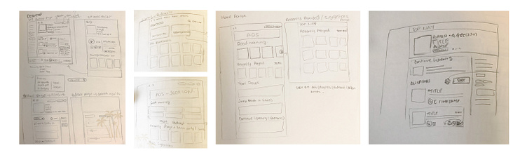
Wireframes
Enhancing the current Spotify Desktop app with advanced filtering options
Due to time constraints, I decided to focus on creating mid-fidelity wireframes that resemble very closely the final product and allow me to iterate on possible solutions faster. Spotify already has a well established visual design and patterns that I tried to keep in mind when sketching my solutions in order to keep consistency and make the new elements flow better in the current layout.
Prototyping + Testing
Testing the advanced filtering options with listeners and gather feedback
Because this approach would add new features to the app, it was important to test the functionality and ease of use with some podcast listeners. The test had various tasks with different scenarios to understand how participants would interact with these additions.
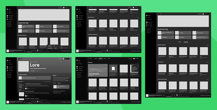
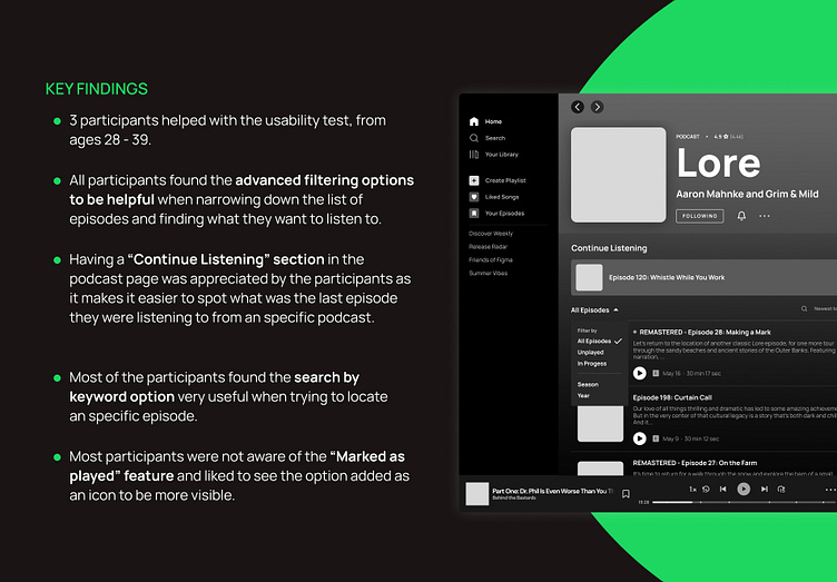
Adding 'Continue Listening' category on the home page and more sorting options for the Recently Played list and the Podcasts section on Your Library section.
Improving the player controls by adding custom skips and chapter sections on the timeline as well as making more accessible the Marked as Played option.
Adding more filtering options and the search by keyword feature.
Explore the prototype here.
All participants were able to complete the tasks provided and found these additions to be very helpful when listening to podcasts with long episodes lists.
Things to improve:
On the podcast page, most participants found it confusing having 2 spots to sort/filter episodes as they felt all options should appear under the item on the right side.
On the homepage, even though they found it useful having a section which lists the last episodes they listened to on their shows, they felt the section title was not clear and could be confused with the playlists section Jump back in.
Lessons Learned
Working on this project was fascinating as it required me to think under the limits of an established visual brand and explore the different ways the solutions could be integrated in the desktop app and still be intuitive and obvious.
Being able to test on early stages of the wireframes is key to get valuable feedback. While testing the prototype, I was able to see how the users interact with the Spotify app, how familiar they were with the desktop app and what current functions they didn’t know about due to the confusing location of the elements.
Section titles need to be as clear as possible. If two sections have very similar titles it could cause confusion for the users who won’t have a clear idea of what the sections are for and miss the information they need to find the podcast or episode they were looking for.
Next steps would be to improve the rating and review system used in the app to boost engagement and increase podcasts reach as well as move the mid-fidelity wireframes to high fidelity.
