Take a Paw - Case Study
Take a Paw was completed as a part of Dribble’s Product Design course. This app helps pet owners find someone they think is trustworthy to take their dog on a walk.
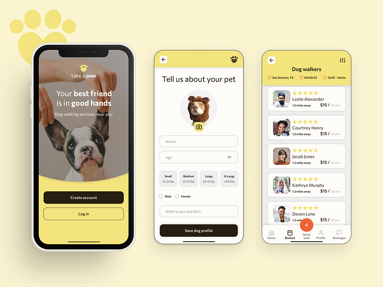
Final prototype and design
This prototype focuses on the onboarding process, a results page, and the profile of a dog walker. The main goal was to make a friendly and simple user experience to help users find someone they could trust to take their dog on walks.
Here is the link to see the prototype in Figma.
Big takeaways
Always have the user in mind:
Towards the end of the project, I felt I had lost my focus on one of the main goals, which was to help my persona find a walker in the limited time she had. To make an improvement I added a button to the menu that opens to a preset of walk options for quick scheduling.
It is important to keep components updated and organized especially as the number of screens grows.
Asking specific questions during user testing is helpful to see if something is working or not and make the appropriate improvements.
I enjoyed working on the user flow and wireframing as well as the testing phases. In my current job, I focus on visual design and prototyping and this was a great way to expand my skills in UX.
This was the final result of 6 weeks of work. If you would like to see the detailed process please keep reading!
Building the app - In-Depth Process
1 - Research & Empathize
Problem Statement
Pet owners struggle to find enough time to walk their dog and feel uncomfortable leaving their pet with a dog walker.
How can we help make this process easier for the user?
For the initial research, I had an interview with a pet owner about their experience with dog walkers. This helped me understand the main pain points I needed to focus on.
I also did market research on current dog walking apps. I looked at 3 different apps and analyzed their user flow to help me create my own.
2 - User Flow and Wireframes
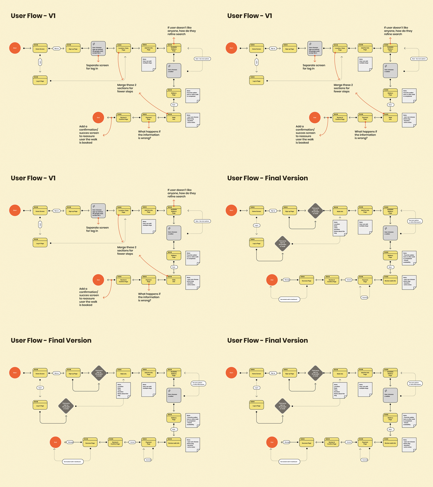
I created the user flow based on the apps I looked at, but in my app users have to sign up to see the walkers and reviews. I made the tradeoff to have a longer onboarding process instead of allowing the users to see inside the app right away. I thought this would increase the user's sense of security and trustworthiness.
I also made several changes to my user flow. In the first version, I had a screen that repeated itself. It asked the user for information about the walk several times. To reduce the number of steps the user had to take, I decided to merge these 2 screens towards the beginning of the flow.
I added screens to show the user a successful booking and the option to contact the walker before their scheduled walk.
To start the wireframing stage I corrected some of the user flow steps to make sure all the screens needed were included in the next step. In the end, I only focused on the onboarding process and the profile of the walker.
I created several quick sketches for each screen and took the elements of layouts I liked best.
Throughout this process, I felt there were new steps or items I wanted to add and found it difficult to know what to keep (due to time) without completely starting over.
I decided to focus on the user flow and wireframe I'd done and choose the main screens I felt were important to show.
3 - Visual design and components
I based my visual design on the following values:
Trustworthy: The user cares about their dog (they’re part of the family) and wants their dog to be taken care of and be in good hands.
Minimalist: The user needs to find things quickly as they don’t have a lot of time.
Uniqueness: There is established competition from other apps, so I wanted to use different colors.
This project helped me practice using components and auto-layout to create a design system. It also made me realize how important it is to keep it organized and expand it as needed.
4 - Prototype & Testing
The final step was making the prototype and having users test the onboarding flow to improve the user experience.
I had 3 people test the app and with the information gathered, I made the following changes.
I would’ve liked to test V3 once more but I think though small, the changes made were important and improved the overall experience.
You can test the prototype HERE, any feedback is welcome!


