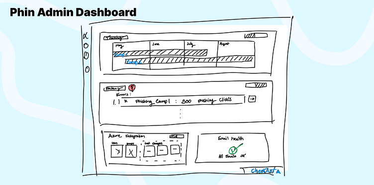
Phin Dashboard Planning
Increasing Phin’s platform transparency by building a dashboard to answer customers burning questions.
The Proposed Dashboard Design:
Phin Security is a product that allows IT Departments to schedule artificial phishing messages, and offer cyber security training videos to its employees. All the training, analytics, branding, and phishing is managed from an admin portal. Company employees access this training via links send directly to their inboxes. This dashboard page will take the place of the current company home page inside of the admin portal. It will be the first page that the admin sees after selecting a company.
Summary
The IT professionals that manage company cyber training with the Phin are busy people. They use many different IT tools to run the IT Department for several companies. With all the resources for learning available in Phin it can take some time to configure a companies training. One of our core goals at Phin is to try and reduce the amount of time that it takes to manage our product. We believe that in creating this dashboard we will able to quickly answer the most common admin questions and reduce the amount of time needed to manage several companies trainings.
Read More: My In-Depth Process
Problem Statement
In order to effectively manage your security training through Phin, admins need to source information from many different places around the application. This is costing users extra time.
User Research
In the last several months our support team has received a lot of questions on how and where to view training assignment schedules and read training analytics. We took these questions and built user flow diagrams from them.
These questions seem to stem from having information on failures, sending times, and user analytics split into different pages of our admin portal. We believe the best way to start tackling this UX issue is to create a dashboard to bubble the important information straight to the home screen. This dashboard would also give users an alternative way to get to the screens that will give more context to their questions.
User Flow
From all of these questions we generated a set of current app user flows. These user flows directed people all over the app, and some times even pointed people to contact us through support. Our proposed dashboard aims to answer as many of these questions as possible in one spot.
Before we started sketching out a dashboard we needed to create a list of components that might answer the admin issues.
These were the components that we arrived at:
1. Training Issues component:
1. Show Users not slept or getting trained (toggle off/on)
2. Show Users not completing courses in time
3. Show Users repeat failing courses
4. Link to training analytics
2. Training Scheduler:
1. Show latest 3 campaigns on a calendar
2. Show last 3 months of training modules from a given campaign(assuming there have been 3 months)
3. Show what the next module/topic is for the latest 3 campaigns
4. Show when the next module will land
5. Link to training campaign dashboard screen
3. Phishing Issues:
1. Show Users not slept, or getting phished (toggle off/on)
2. Show Users clicking multiple phishes
3. Link to phishing analytics
4. Phishing Scheduler:
1. Show latest 3 phishing campaigns on a calendar
2. Show roughly when the next phish is going to get sent
3. Link to phishing campaign screen
5. User sync issues:
1. Forward user sync errors
2. Link to user sync page
6. User sync updates:
1. Show the last sync time
2. Show latest sync changes (n added, n updated, n deleted)
3. Link to user sync page
7. Email sending issues (Spam bypass/Mandrill Sending):
1. Forward email sending errors
2. Link to logs page
Wireframes/Sketches
Some of the contents of these components were very closely related. For example instead of building an error component and a training schedule preview component. We could just build one training status component. This took us down to just 4 components that we would need in our dashboard. Each component will be able to show current status and potential errors.
Conclusion
That is where we decided to leave things for now.
1. We analyzed where potential confusion in our application comes from.
2. Settled on a plan a admin dashboard
3. Created updated user flow diagrams for the dashboard
4. Complied a list of components to answer recurring questions
5. Started to layout the new components on the company home page


