Case Study: Biscuit the Dog Care App

Design Brief
Problem
New and old dog owners often need help taking care of their pets. Pets need trustworthy vets, dog boarding services, grooming, food, potty walks, training, toys, accurate health records--the list goes on.
How can a company create an app that comes alongside these pet owners so they can spend more time enjoying their furry companion?
Answer
As part of Dribbble's Product Design course, I designed part of a mobile app to assist dog owners. After user research with dog owners, I pinpointed what features would be most helpful for them.
New users and old users alike agreed that one of their main pain points was finding a trustworthy place to board their dogs, so I designed mobile app pages necessary to find a boarding service.
Problem Statement

How can we connect users with the products and services they need in a way that engenders the trust of dog owners and maximizes company revenue?
User
New dog owners and experienced dog owners.
User Problems
My initial hypothesis was that dog owners needed help with reminders on when to take care of their dog and for finding trustworthy services.
Goals
Business goals: Generate revenue from referrals to dog products & services, secure private user information, protect the company from any liabilities.
Dog owner goals: Keep dog healthy, happy and alive.
Service goals: Generate warm leads.
User Research
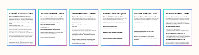
I had a hypothesis on what dog owners wanted, but I needed to actually connect with them to find out the truth.
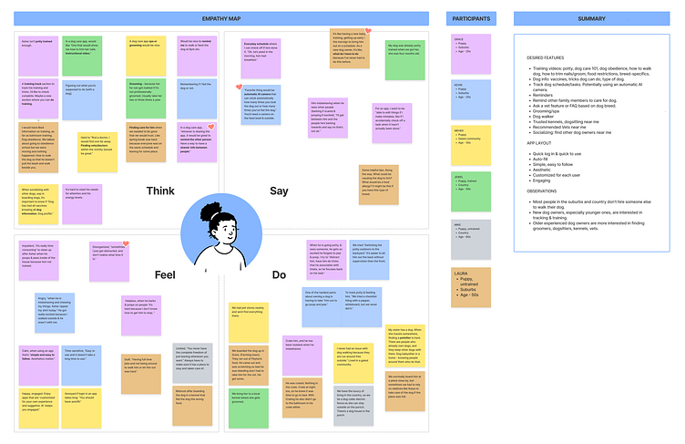
I conducted remote user research interviews over the phone with six dog-owners of varied ages (20s-60s) and genders. I summarized my interview results within an empathy map to determine patterns.
Research Results
NEW OWNERS: Interested in tracking & training.
EXPERIENCED OWNERS: Often older in age, more interested in finding groomers, dog-sitters, kennels, vets.
LOCATION; Many people in the suburbs and country don't need to hire someone else to walk their dog. With prevalence of work from home, even city dwellers have more time to focus on their dogs.
DESIRED FEATURES:
Training videos.
Store dog information. Vaccines, tricks dog can do, type of dog.
Track dog schedule/tasks.
Potentially using an automatic AI camera to capture if a task is complete.
Reminders. Remind other family members to care for dog.
Ask a vet feature or FAQ based on dog breed.
Services nearby like grooming/spa, trusted kennels, dog-sitting, walker, vet.
Socializing. Find other dog owners near me
.
Market Research
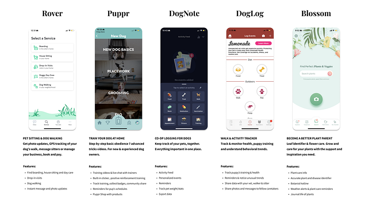
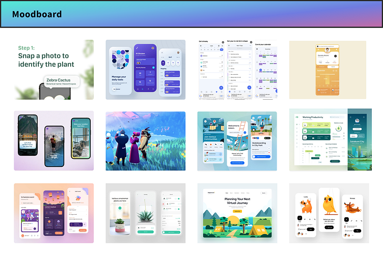
There are many dog care apps on the market. Delving into current market options provided an understanding of what features apps already provide and deem important for users. The most popular apps where the ones that provided dog training options and dog service options. I also included the app Blossom, a plant care app, because it also has features that are worth analyzing.
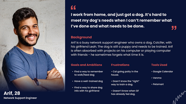
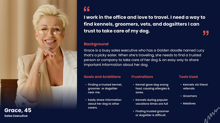
Personas
Based on user research, users were divided into two camps, new dog owners and experienced dog owners. I created two personas to reflect the two user groups.
User Flow
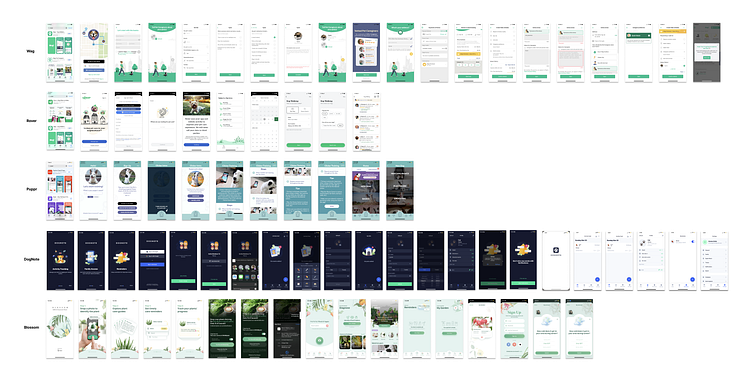
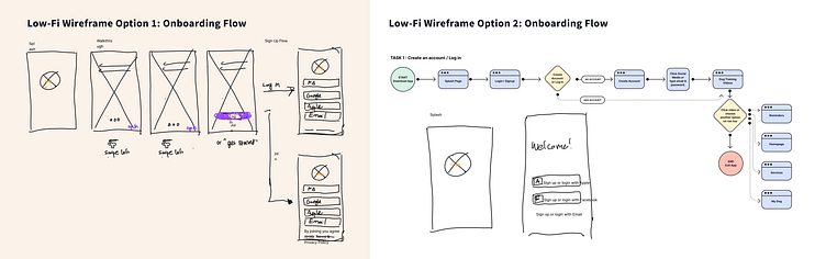
Based on comparison of competitors Wag, Rover, Puppr, DogNote, and secondary competitor Blossom, I created my own onboarding flow for the dog care app. The goal was to keep the flow simple, while still meeting the business goals and user goals.
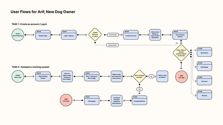
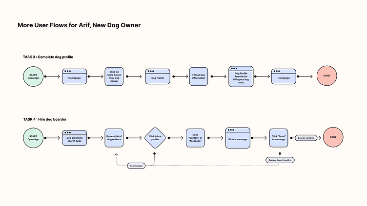
I created four flows of different tasks a new dog owner would need.
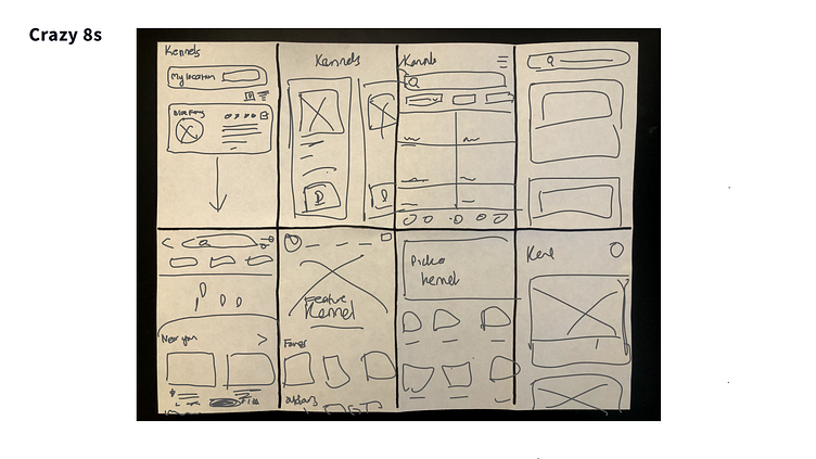
Wireframes
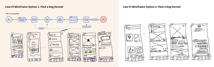
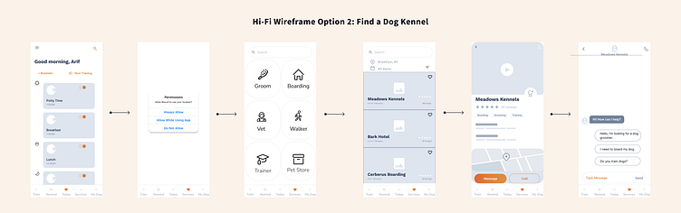
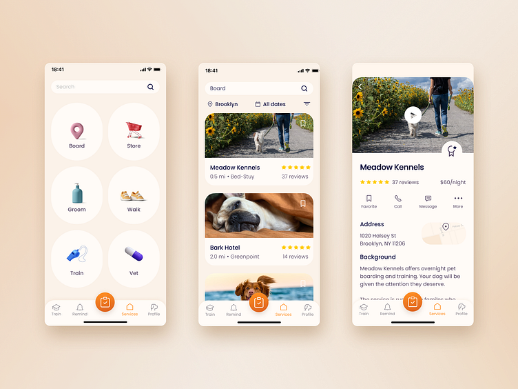
Because of the limited timeframe for the project, my main focus creating the app pages for onboarding and how to search for a dog boarding option. Both new and experienced users alike mentioned a need to find trustworthy dog kennels near them.
I used the crazy eights exercise to come up with layout ideas, drawing inspiration from known design patterns and other apps. I sketched out two versions of app layouts that best fit the user and business needs. I then made it into low-fi frames and hi-fi frames.
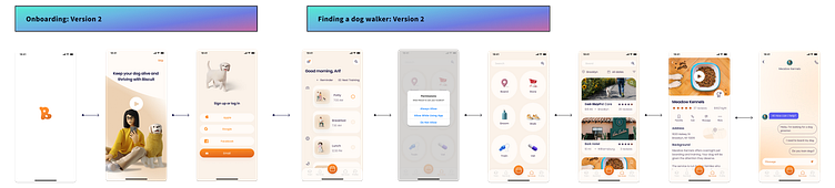
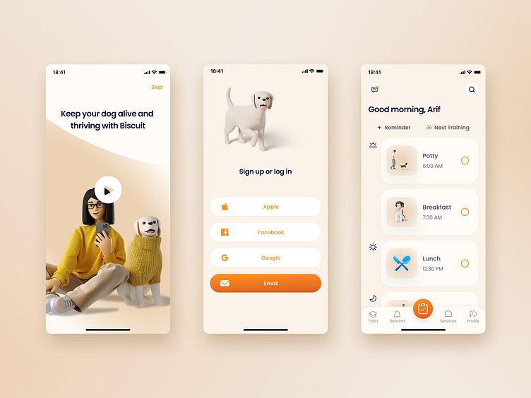
Onboarding Flow


Dog Kennel Search Flow
Visual Design
I brainstormed 5 adjectives that described dogs. I then found layouts that coincided with those adjectives. Dogs are energetic and fun, friendly and warm, joyful, loyal, smart, mischievous. Above all I wanted my designs to feel fun, warm, and trustworthy.

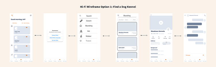
I made two wireframes with visual design extended to all app screens. Using consistent font, type size, and color, I focused on balance, proximity, alignment, hierarchy, repetition and contrast.
I found a visually appealing UI kit and used that for my first wireframes. The wireframes looked clean and modern, but not very warm and friendly.

I found a picture of a website with the atmosphere I wanted my app to exude. I chose images and a color palette that was friendly and soft like a dog. I chose a uniform, more serious typography Poppins to bring uniformity and harmony to the app design. Having a dog is stressful, the app needed to be both friendly and calming.
Prototype + Test
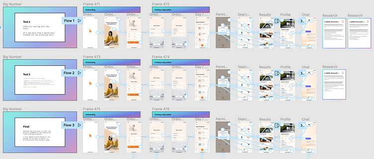
Prototype 1: https://www.figma.com/proto/0QHS2tmmUg1m4LN0lc3N4r/Kirsten's-Project%3A-Dog-Care-App?page-id=4%3A3710&node-id=1357%3A6020&viewport=-229%2C122%2C0.13&scaling=scale-down&starting-point-node-id=1357%3A5962&show-proto-sidebar=1
The first prototype was run by two users via a remote usability test. Based on their feedback, I updated the prototype with a few minor changes:
Changed the icon on the today button to make it more clear it’s a checklist.
Updated permissions question to explain why it would be helpful for Biscuit to get location permissions.
Updated chat suggestions to make it dog-boarding specific.Updated pictures in dog daily checklist so that they would be clearer to user.
Based on their feedback, I created a second prototype and tested version 2 with a user remotely over Zoom and Figma.

I conducted a usability test with another user remotely. Based on their feedback I updated the prototype to take into account the following:
The bottom nav icons looked disabled.
The bottom nav blends into the rest of the page. I added a drop shadow to the bottom nav to make it easier to differentiate from the main page.

Results
Overall, the finished prototype provides the feel and functionality that matched what the user personas needed.
Surprises along the way:
Initially I assumed the most important features for users would be a notification system for reminders to take care of the dog and dog walking services. User research uncovered the effect COVID and working from home had on the needs of users. Many users with dogs have started working from home more, leading to more interest in other services such as dog grooming and overnight boarding.
I was pleasantly surprised how quickly users went through the prototype. The only time a user got stuck was when they assumed the bottom nav was disabled.
The fast turnaround of this project was a lesson in how important it is to get user feedback early and often. I could have spent time building out the entire app and applying a visual design to it, only to have to scrap everything based on feedback from usability testing.
Next Steps
With more time, the rest of the mobile app sections need to be built and features added, especially the below:
Training: Videos, training tracking & rewards
Calendar: notification scheduling, sharing push notifications between multiple pet owners
Dog Profile: health record, training achievements, history of services used, profile settings.
Acknowledgements
The following websites and apps were used to help build my wireframes and prototypes:
3D images: Icons8.com
Icons: Iconify
Wireframes: Wireframy
UI Kit: marvisIghedosa/figma
