Chat - Outside the Inbox
Ch@t is an all-new email application that behaves more like a chat-based application and collaboration tool centered around user communication. Tech-savvy users who prefer texting will love this concept. I invite you to read through my case study to see how I solved the requirements for this app.
Userflow + Prototype
Straight to the action
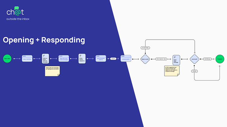
Since this is a desktop application, views/pages are visible. User interface elements such as topical tags, threaded messages, and smart-folder / filter are immediate and able to be used at any given time.
Naturally, an email application should perform multiple functions in a single view. For example, users can choose to reply using “quick reply” canned responses or the user can directly reply using the text box input field. Both the quick reply and text box input fields are visible and part of the same view.
See it in action! | View Prototype
I wanted the location of quick replies to be close to the action and not hard to find. The quick-reply feature makes it easy to instantly send messages to new conversations or respond to current discussions.
Goals Completed:
Threaded chat style email view
Canned Responses
Smart Folders and Filters
Topical Organization
What's Next: Fetching a Message
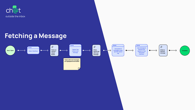
Part of the email experience is being able to refresh or reload the app to fetch and get new messages. I wanted to share this experience, but also demonstrate how topical tags work. Topical tags act like smart folders but are for active email messages. Whereas, folders are more for “cold storage” and archiving.
See it in action! | View Prototype
As new messages are fetched, topical tags light up to inform the user of a new message or response to an existing message. I also included a green dot on the card to indicate which card is new or has a reply.
Additionally, I wanted to showcase how the AI / ML text suggestion interaction could work.
Goals Completed:
AI driven suggestive text
Up Next:
Why Did I make these Decisions?
Thought Process
Research + Problem Solving
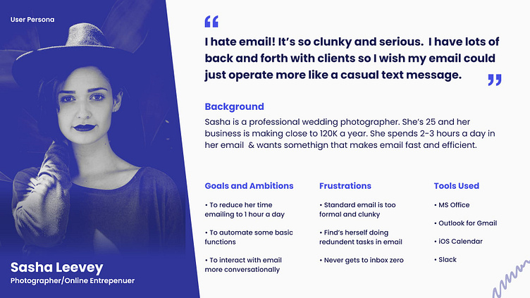
Inbox zero is a challenge for anyone to achieve. Removing the inbox would be one approach to solve Sasha's frustration. However, the inbox view is critical to organizing clutter and the everyday noise of email communication. An alternative idea would be to soften the noise around the inbox and simplify interface options down to core features. These core features should leverage modern technology so that users can filter messages topically or use traditional folders for long-term storage.
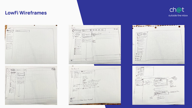
The final visual design of the app is very close to the early low-fidelity sketches. Many of the elements are inspired by the best parts of Slack, Gmail, and Office 365 but distilled down to core features.
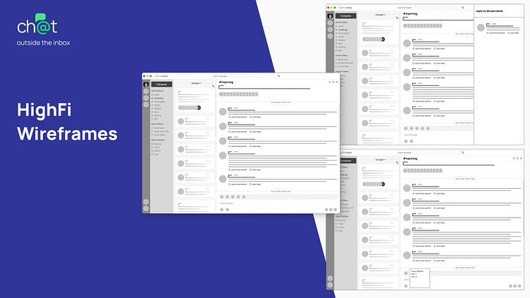
The high-fidelity wireframes demonstrate how the three interface panels lend to the merging of a traditional email application and a collaborative chat application. Functionality is at the surface level so that users can intuitively traverse through the panels via familiar interface patterns.
Leveling Up the Experience
Visual Design + Components + Prototyping
Visual Design - Card Patterns
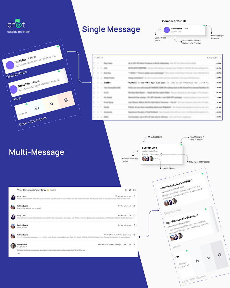
The single message card is an expression of what users would see in a list of recent or previously read text messages. To reiterate, Sasha mentioned that a pain point is not being able to get to inbox zero. Reshaping how a traditional inbox behaves could reduce that anxiety and allow Sasha to move through messages naturally.
The multiple message card expands on the single card which showcases a limited number of participants and prioritizes the subject line.
Visual Design - Colors
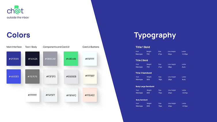
I decided early on that I wanted to tackle the visual aesthetic of the email application. I knew that colors shouldn’t overwhelm the experience but inform users as they flow through the app. Using the two shades of blue as the primary interface colors allows the design to flow from left to right and establishes a hierarchy of importance on the elements in play.
The Results
It was relatively easy to solve a few goals immediately once I started to wireframe the interface. Threaded topics, canned responses, AI suggestions, and smart folder/filters all fell into view quickly because of the mashup of Slack and Email. The concept is complete but the challenge to make it work with decades-old technology is a journey for another time!
