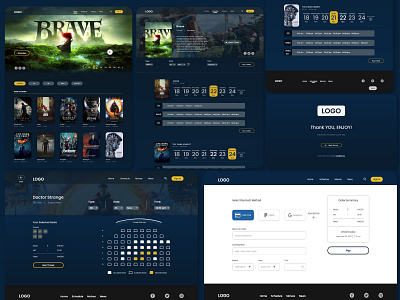
Cinema Ticket Booking Flow For Website
As the second part of my Google's UX Design Professional Certificate, I designed ticket booking flow for a cinema.
The product:
A website ticket booking app flow for a cinema company.
Project duration:
May 2022 to May 2022.
The problem:
Booking tickets from a website can be a little tricky some time with all the movie selection options and their schedule.
The goal:
Design a UX that lets the user book a ticket for a movie smoothly as possible. And make the movie scheduling design as easy as possible so it doesn't get confusing.
My role:
UX/UI designer designing a web flow for booking the tickets online.
User Pain Points:
Movie ticket booking websites often have a confusing user flow towards the final checkout.
The scheduling page gets intimidating and a little scary with a lot of information.
How I solved the Problems:
Made multiple ways for the users to book a ticket on a website. Doesn't matter where the user is on the website, the user will always be able to book a ticket from any page throughout the website without jumping around the pages.
Made the information on the scheduling page easy to read as possible with all the information available under the title of the movie so the user can get all the time and date info without clicking anything or going in different tabs.
Added the "Book Ticket" button on the scheduling page, so users can book a ticket directly without coming back to home page.
What I learned:
How to use negative space in your advantage as much as possible. Woking on this project, visiting different sites as a competitive audit and interacting with actual users, really helped me to empathize deeply with the users. This project is definitely a level up for me.
