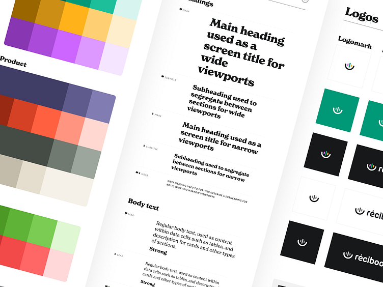
Recibook website style guide
What is Récibook?
Specialized for young people, Récibook creates audio experiences to increase customers' brand awareness by inventing new stories or adapting existing ones.
What was the challenge?
A brand such as Récibook should shout joy, creativity, and childish curiosity. While the team behind the company is nothing less than that, their website as a key marketing tool was misaligned with their company culture, and their service offerings.
That‘s why we stepped in to design a website that visually expresses everything that Récibook is and does, thus providing a better brand picture to their customers.
And to put a cherry on top, we came up with a logomark—a blend of audio waves and a microphone.
Services provided
Visual identity
Website design
The team
Zlatko Najdenovski - Logo, Website design, Art direction
Jovana Trajanova - Visual design
☞ www.recibook.fr
—・• ● •・—
Unsure whether your need a design love for your website?
Write to us anyway. We'll review your ideas and share some bits of advice.


