Fetch! Case Study
Fetch! was a 6-week UX/UI study of the current dog walking market and how an app can better solve both users’ (dog owners and dog walkers) recurring problems.
During my initial research, I needed to collect more data than in-person interviews could provide. I created an online survey connected to a Google Sheet via zapier, then posted it in a facebook and reddit dog owner group to gather real-time feedback.
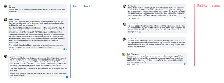
I also reviewed numerous articles and compared other reader comments to get a better overview of the current atmosphere around dog walking apps.
My research concluded with three common discoveries

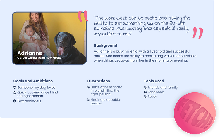
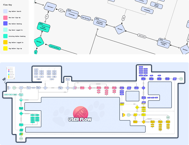
With persona in mind, I created a user flow stripped of features, while still being aware of the required needs for different users/stages of the experience.
Users are not required to create an account, just enter a zip code to see available walkers.
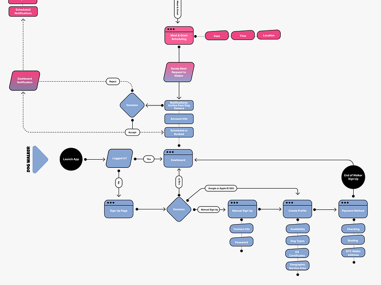
To help offset potential walker/pet incompatibility, new connections must setup a meet in-person at a neutral location. While this is more effort on both parties, it addresses things that couldn’t be verified via an online background check or certificates.
From there, I translated user flows into sketches that continued to develop into high fidelity visual designs.
The look and feel was mimicked after a Kong toy; colorful, fun, and simple. Something all pet owners are familiar with.
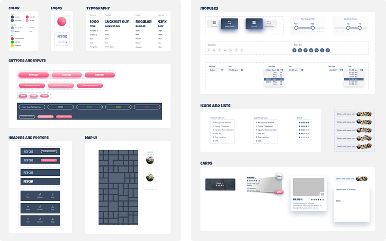
Creating a design system for speed, scalability and consistency.
Testing encouraged two critical design changes, both concerning navigation.
My most significant learning from this study is the importance of testing your prototypes with your target market. Their insights were valuable in contributing to the design and functionality of the app.
