Screen Shot 2014 12 05 At 10.07.57 Am

Helping citizens see how water quality monitoring stations in their communities are performing by brining lab tested data online.
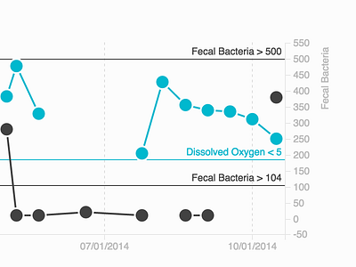
The visualization helps members of the community see when certain water elements are above (red), nearing (yellow), or below (white) their allowed threshold of safety.
The chart enables further investigation into what elements and conditions, like temperature and rainfall, affect each other.
Visit HarborAlert to try out the finalized visualization and time series tools