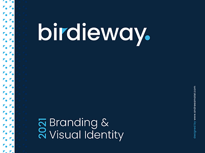
Birdieway - Brand Identity
BIRDIEWAY
I've had the pleasure of creating the branding and full visual identity design for Birdieway, an investment management company.
The objective was to properly represent and position the brand to the targeted audience (high network individuals) as being strong, successful and trustworthy, while also making sure that they are properly differentiated from the rest of the companies in the field.
The challenge was to encompass one or more golf elements in the logo design ("berdie" is a golf term, and the source of inspiration for the company name), but keeping away from the sporty look and vibe, while maintaining the high-end feel to it and staying true to the intended purpose and message of the brand. Thus, the Birdieway mark consists of a ball and a flag, which are both encompassed in the typeface, and have a double entendre: they represent golf accessories, on one hand, but also relevant financial terminology (the flag), and a sense of decision / confidence / completeness (the dot).
