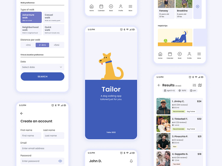
Tailor - Dog Walking App
Overview
Tailor is a mobile application that provides a dog-walking service specifically for owners who have either anxious or high-energy dogs.
This project was part of Dribbble’s Product Design Course where I learned the different stages of building a mobile application through the product design process.
Process
1. Research
2. Ideation (User flow, wireframes, and visual design)
3. Prototype
4. Test
5. Refine & deliver
Problem
Dog owners sometimes need help caring for and walking their dogs. However, it is difficult for dog owners to feel at ease when leaving their dogs in the care of someone they don’t know and vice versa (someone who doesn’t know the dog).
Solution
The goal of Tailor is twofold: (1) to create a service to connect dog owners with dog walkers; and (2) to help dog owners feel calm and secure in leaving their dogs in the hands of the dog walker.
Project Breakdown
Research
Before diving into designing the app, setting a clear goal is crucial. I was paired with a couple peers to start brainstorming the goal that our 3 users (the business, dog owners, and dog walkers) would like to achieve through the dog walking app.
Due to the limited time, I focused on achieving the user's and business's goal for this project.
Once we put together a general goal, I started researching the current market and defining my target audience.
I looked into existing dog walking apps, identified pain points, and interviewed at least 2 dog owners to understand their perception and feelings towards dog walking apps.
Current Market
I looked into four dog walking apps: Rover, Wag!, Barkly Pets, and Fetch!.
What I found was that these apps provided many different types of services such as dog walking, boarding, sitting, medical administration, drop ins, and training. But it seemed like these apps didn't seem to have options that were necessarily catered to dogs with anxiety (i.e. rescue dogs) and hyperactive dogs.
This pushed me to focus only on a single service (dog walking) rather than creating a plethora of services.
Target Audience
Based on user research, I was able to have a general understanding of dog owners' current frustrations and goals.
User Flow
The two core functions of the app were: the signup/sign-in process and booking a dog walker. I created the two user flows to ensure that the process would be smooth and set the user up for success.
At first, I had both the signup/sign-in process and booking process in one flow, but it got hectic quickly. I ended up focusing on the signup/sign-in process first in terms of user flow, wireframes, and visual design then went back to and worked on the next flow.
Wireframes
During this stage, there were a lot of iterations and brainstorming on the layout and goal that I wanted to capture for each screen.
I started off sketching with pen and paper, and once I had a general layout in mind of each screen, I moved to Figma and created low-fidelity wireframes.
Image above is version 2 of low-fidelity wireframes for the signup flow.
There were times when I was in the visual design stage and realized some of the layouts I put together didn't make sense and would go back to the drawing board. One screen in particular was the dashboard/homepage that I constantly went back and forth with.
Image above is version 4 of low-fidelity wireframes for the booking flow.
Visual Design
The overall design of the app revolved around 3 words:
smooth, trusting, and calm.
Based on these three concepts, I put together a mood board to get a better idea of how I wanted my application to look and feel.
Initially, I was unsure if I wanted “calm” as part of the brand personality because I associate “calm” with a meditation/yoga app. However, once I looked back to the end goal I wanted to achieve (to have my users feel calm and secure), I was confident in moving forward.
Branding
To ensure that there's brand consistency & scalability across all screen designs, I created a basic branding library which consists of color, typography, grid, and components.
Prototype
Below is a prototype preview of booking a dog walker.
Screen Designs
Learnings
What I've learned from this project is to focus on one task, one flow, one goal at a time as things can get very complicated pretty quickly.
Although this project is considered "complete", I see ways to improve the application and new opportunities each time I look back. But I think that's the beauty of product design. 😊
Credit
Thank you Jesse Showalter & Dribbble for this amazing course and thank you Yisel Rosario-Chang for your guidance and feedback throughout the course. 🙏🙏


