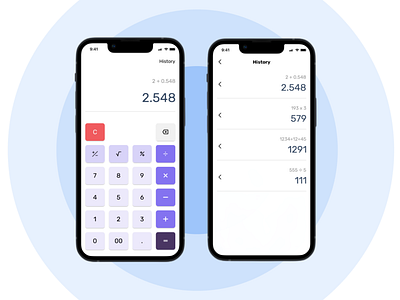
Daily UI 04 - Calculator
I will explain briefly the design decisions:
I use different shades and tints of blues to put emphasis on the buttons based on its common usage or importance
The Clear button's color is red to make users more cautious and not subconsciously or mistakenly click it
I use a line to split the two parts instead of putting the calculations and result in a box to give the design a more minimal and clean look
The watching history feature for tracing back the previous calculations
I'm really hope to get feedbacks from you guys <3
More by Leon Thái View profile
Like
