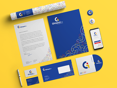
Ghiseul - Brand Identity
GHISEUL
I created a proposal for the rebranding of Ghișeul.ro, the official national online payment platform of Romania, used by citizens and companies to pay for over 350 public services offered by nearly 1000 institutions and authorities.
I wanted the logo to be modern, minimalist and bold, conforming to the current design trends in the digital industry. The color palette brings together the three colors of the Romanian flag: blue, yellow and red, thus making a direct reference to the fact that the user interacts with a state-owned institution.
The symbol (logomark) is composed of geometric shapes in vibrant colors, having multiple meanings:
1. the abstract capital ‘G’ - a reference to the name of the platform;
2. we distinguish a man with his arm outstretched towards a counter;
3. the simplicity of the geometric shapes and the use of basic primary colors, symbolizes the accessibility & user-friendliness of the platform, that can be used by anyone without a need for advanced technological skills. The friendly, yet bold font helps create a strong image, a memorable and impactful branding, thus sculpting the artistic direction for all future visual elements of Ghișeul.ro.
