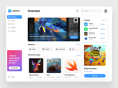
App Store Redesign concept
💌 Have a project idea? We are available for new projects!
info@ronasit.com | Telegram | WhatsApp | Facebook | Linkedin | Website
The redesign is one way app users and designers can tell what they like or dislike about a particular webpage or an app design. Today we’d like to share our vision for App store UI design.
This web page displays a sidebar, the filters, and the lists of trending games and apps with eye-catching banners.
We made the background of this redesign white and added a lot of vivid app and game banners. When making this redesign, we tried to stay as consistent as possible with the design style of the app store.
Our designers tried to make the original app store design a bit simpler. The renovated design looks fresh and it will provide MAC users with a smoother in-app experience.
Share your thoughts about this redesign in the comments!


