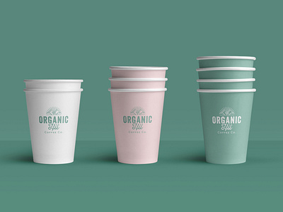
Organic Hit Coffee Co - Brand Identity Design
Organic Hit Coffee Co. is an independent, family owned coffee roaster based in Auckland, New Zealand. Their experience stretches for 15 years, through café ownership to coffee roasting. After researching the target market and the competition we have created a logo which typeface, colours and icon reflect the company’s organic product.
Roboto Mono – a neo-grotesque sans-serif typeface was selected for the brand’s core typeface. The colour palette plays an important part it the brand’s overall look and feel. With the primary colour being a sage green with a hint of teal to ensure the brand reflects an organic feel and has a fresh and vibrant look – definitive aesthetic point of difference to competing brands.
A supporting palette of pastel tones to compliment the green was created, which reflects the natural beauty and vibrancy of South America – where they source their coffee beans.


