Education App UI Design
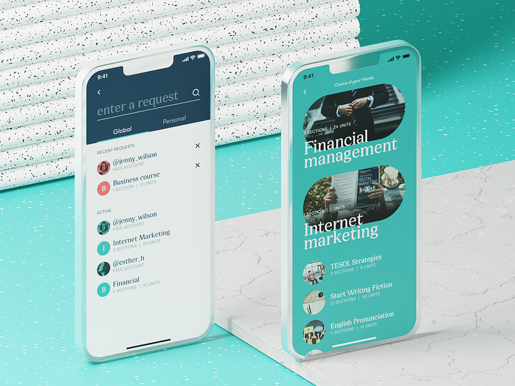
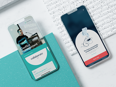
"An investment in knowledge pays the best interest," Benjamin Franklin once mentioned, stating the idea that has never lost its relevance. Our new mobile design project also touches on that topic: take another glance at the mobile application that allows users to access the vast diversity of various education courses, from general to narrow-focused, from professional to those that develop a broader outlook and deeper understanding of yourself. Functional, readable, and solid, using the power of negative space, effective color combinations, and different types of contrast, focused on intuitive navigation and compelling content presentation, it helps users invest much in their knowledge. Here's a look at the screens for catalogue of courses and search interactions. Stay tuned to see more!
Also, welcome to check:
• the big collection of our design case studies
• the huge set of design concepts for business
• the UX practices of product page design
• the tips on how to apply web animation
• the insights into aesthetic-usability effect in UX design
—
Tubik | Tubik Blog | Behance | Instagram | Twitter | Facebook

