Music Store Website
Hi, ya'll!
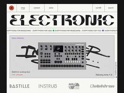
As you know, Zajno develops multiple websites for different purposes. In the case of this shot, the core idea was the creation of a musical equipment store with something similar to street brands. In other words, it should be simple, understandable, and in line with current trends. Be you either a beginner or a pro, you can find the desired item for yourself.
But what does it mean to be in accordance with current trends? In my opinion, this is all about modernism, broken grid, and, of course, not ordinary fonts. I was looking for font solutions to emphasize the musical wave as if you 'read' into music vibrations, which I've come up with.
The main challenge in music stores is the lack of uniqueness; they are faceless and look like standard marketplaces. The task I was faced with was to make this store stand out. That's why I created a logo with the decoding of Drum and Bass music and put the style of a label that can be used anywhere, from a website to printing stickers. The handier your logo is, the more people will be aware of your shop.
What’s your stance on it? Let me know in comments!
Website |Join our Newsletter! |Crappy Explanation Playlists App |TheGrid |Spotify |Twitter |Medium |Facebook|Instagram


