UI UX Tips #30: Differentiate Primary and Secondary CTA
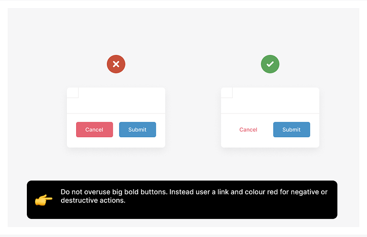
Do not overuse big bold buttons. Instead use a link and colour red for negative or destructive actions. Differentiate Primary and Secondary CTA
More by Himanshu Sharma View profile
Like
