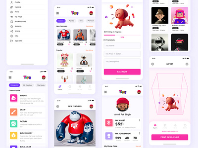
TOYS
Hello guys 👋
Finally the TOYS design is done! I think it looks modern, clean and attractive from the graphic point of view. A lot of spaces, contrast colors, playing around the font size let to achieve that kind of effect of course if you agree with me - let me know in the comments which login screen you like the most
As all the objects are created using shapes so its very easy to customize and update.
Template that were posted in available in -
Figma
Highlights
Poppins Family Font
Please show a little bit of appreciation! & show some ❤ and follow me.
FOLLOW ME ON MY SOCIAL PROFILE
UPLABS | DRIBBBLE | INSTAGRAM | TWITTER | BEHANCE |
PINTEREST | LINKEDIN | FACEBOOK |
designer by day✒️
gamer by night🎮
hi! i’m md tazim. for decades, i’ve been wasting my time playing games🎮 & chilling out on netflix🍿 in my free time, i design some amazing resources for designers, developers & xenomorph👾.
& for those who pay for my coffee☕
waste my time here👇
Enjoy!👽


