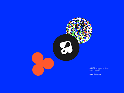
#21 Shokha Iryna | Graphic Designer | Akita identity concept
Test task completed — April 13, 2022
Contact — @iren_la_luna (telegram)
Portfolio — https://www.behance.net/bruks223316de
Our comment:
We liked the well-thought-out idea with atoms and neutrons, which are put into the product style identity, underlies all the materials, and are written down into a logo. icon build. The mood board tricks are well-seen in decisions. The typography is too simple, and it lacks some work. Also, in our opinion, there is not enough connection between logo icon and font parts. Identity’s plan always separates them.
More by Lazarev. talents View profile
Like


