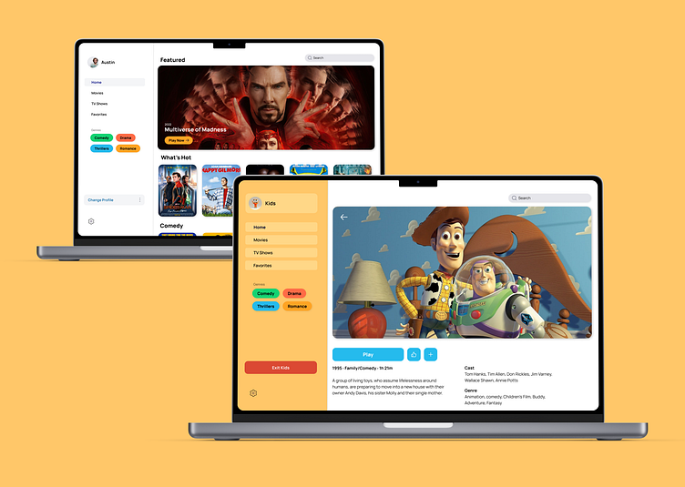
Netflix product (and branding) redesign
A Dribbble product design course capstone project.
Overview
This is a Netflix product (and a little bit of branding) redesign.
Goooals of the project:
Users must be able to switch profiles within 6 actions from anywhere in the app.
A confirmation screen that profiles have been switched is required
Also there must be a visual difference between the interface for adults and the interface for kids
Research
My research found that younger users are having a difficult time switching from their parents' profile to theirs. There are too many clicks in process, or they flat-out couldn't locate the profile switch button.
Design
Wireframes
Wireframes help me with a basic layout and hierarchy. I knew the "switch profile" button needed to be easy to find. I also wanted the navigation to be super quick, (having used streaming services myself.) I opted to design a fixed dashboard to the left side of the screen. That way the user could move quickly up or down to get where they want to go.
UI Design
I wanted this product to be spacious and easily navigable. The primary color palette works nicely with a lot of white space and offers multiple options for buttons, categories, etc. I also used colors that require more attention–like red–for wayfinding.
Branding
This wasn't a Netflix product redesign initially, but I thought it would be fun to redesign their logo and use it as the face of the project. I really needed something for an opening delay screen of the product. (It animates nicely, too.)
6
Interviews with little cousins (nightmares)
4
Iterations
9
Screens (and counting)


